
Case StoryBrand systemsLos Angeles
A kombucha in a cape and a plant milk with a crown. I took both brands from the big idea to the tiniest banner, and neither one lost its powers.
Everyone loves the big idea: the key visual, the hero shot, the launch film. But most people meet a brand somewhere much smaller, like a banner on a grocery app, a sticker on a fridge door or a sign on a café floor. That’s where I spend a lot of my time, and where a lot of brands quietly fall apart. GT’s SYNERGY and Califia Farms asked me the same question: how do you keep a brand feeling like itself across dozens of formats, three countries and one superhero, with someone else’s rules on every one? Here’s how I answered it.
- 60+ formats
- Finished for SYNERGY × Supergirl, from a 320×50 banner to a store easel.
- 1 key visual
- Rebuilt for every room: retail media, in-store, owned and social.
- 3 countries
- For one Califia system: the US, the UK and Australia.
- 14 projects
- For Califia, from a butter launch to a café floor.
01 · After the big idea
One hero, many shelves
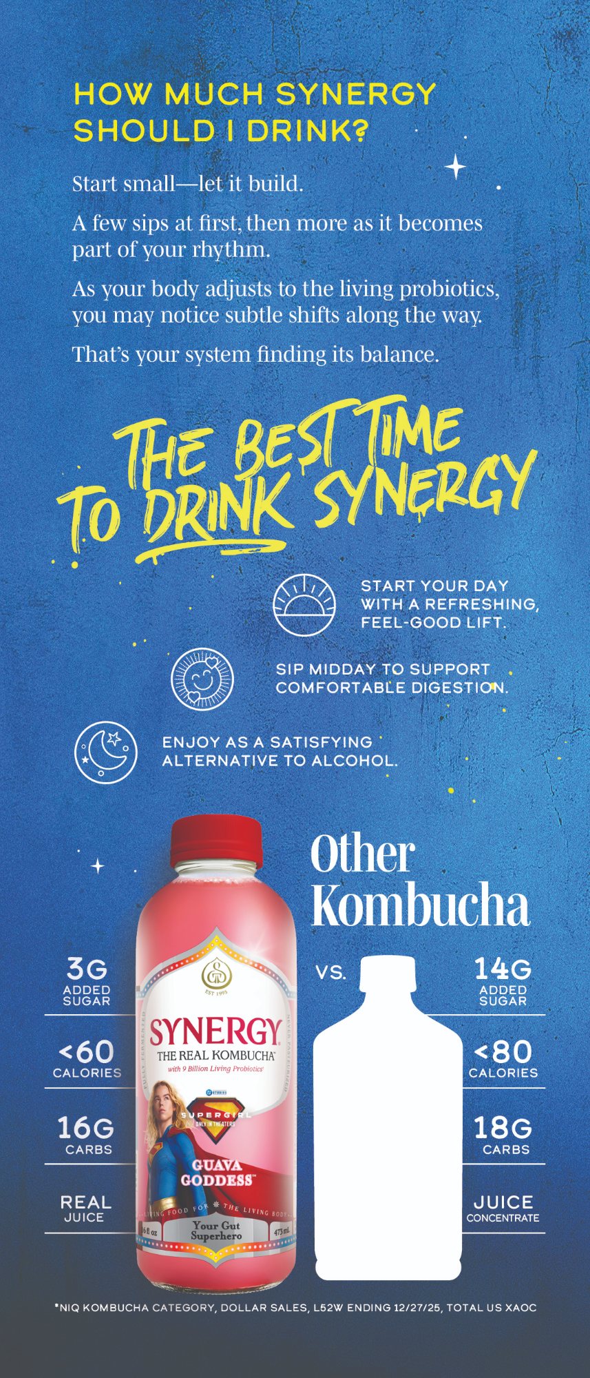
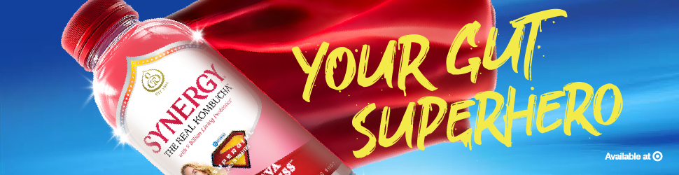
Everyone wants to make the key visual. I’m the one who makes it survive the shelf. For the Supergirl movie, SYNERGY, GT’s best-known kombucha, put four limited-edition bottles in a cape: Trilogy, Mango, Peach and Guava. Then the campaign had to turn up everywhere a shopper might bump into them: Target, Hy-Vee, Instacart, Whole Foods on Amazon, product pages, a store easel, a postcard, GT’s own email and website, and a stack of social and display ads.
GT’s in-house team made the key visual, and the lettering came with the film. Everything after that was mine. I rebuilt one hero image, frame by frame, for every retailer, size and rule, and made the pieces the system was missing: font drips, seals and icons. Every frame also had to get past a film studio and keep a co-branded partnership perfectly balanced. Superhero work, minus the cape.
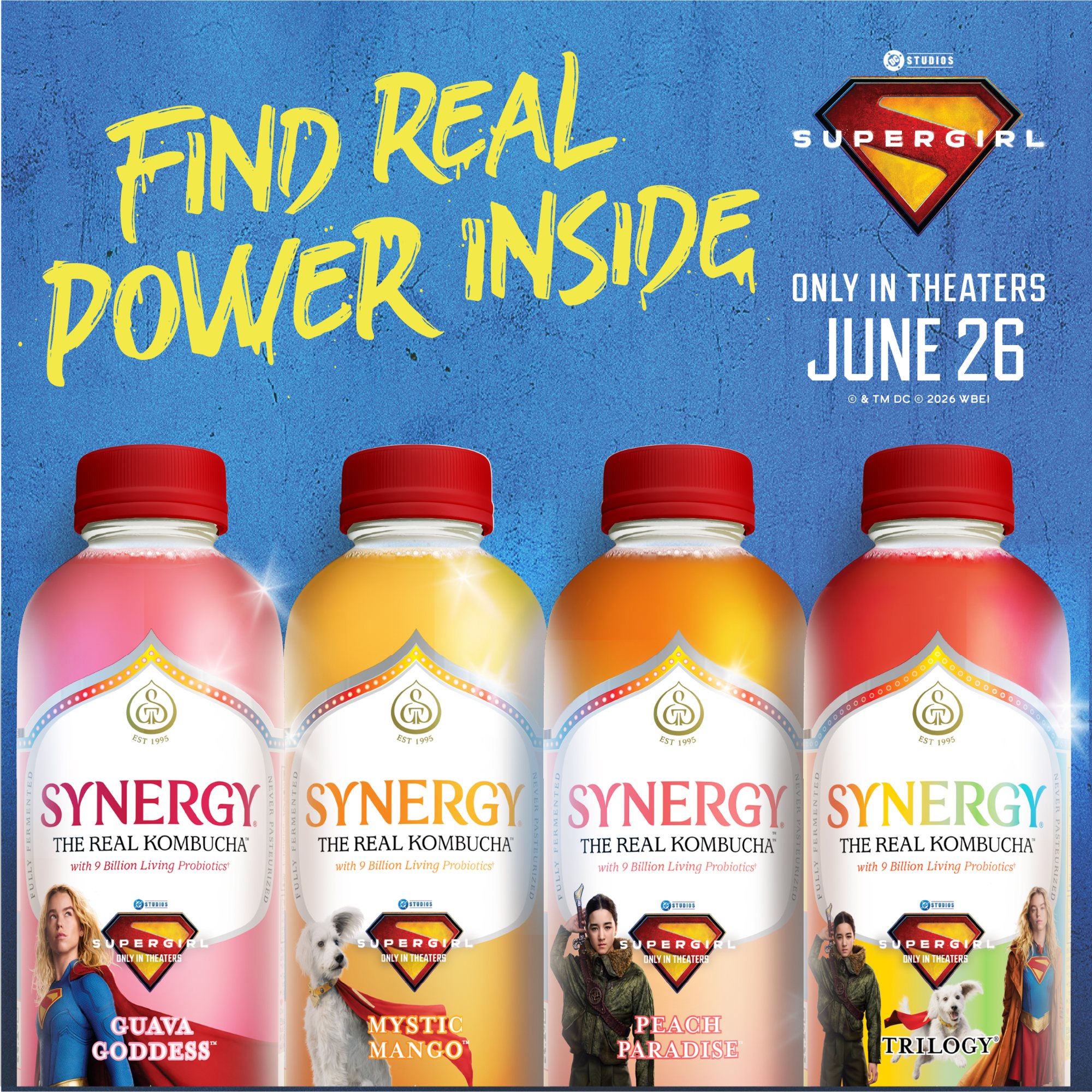
One hero, many frames
Drag to explore →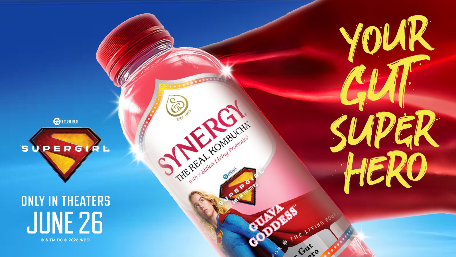


02 · Small print
Where the rules live
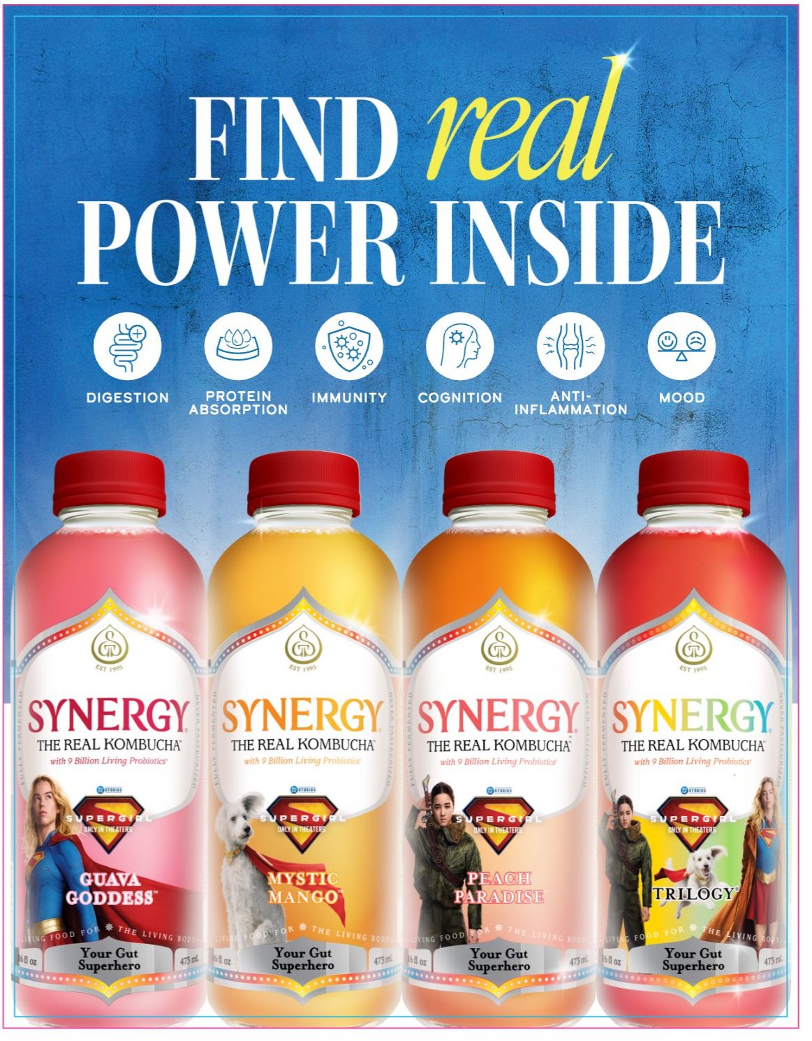
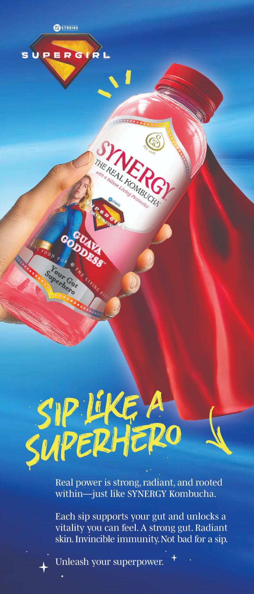
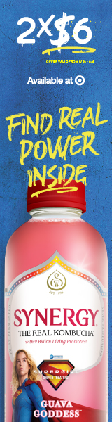
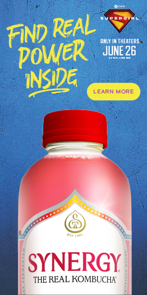
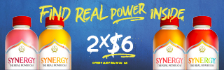
Retail media looks simple until you read the spec sheets. Target wanted the offer, the dates and an “available at” logo, in twenty sizes. Hy-Vee wanted a tagline in 22 characters and a logo that works in a circle. Every sweepstakes frame needed its fine print, and could never, ever say “buy to enter”.
Composition is how you win inside all that. I decide what the eye hits first at 3200 pixels wide and again at 320, where the bottle sits so it’s still the hero, and when a seal earns its space. Same superhero, same kombucha, a dozen different rooms, and every one of them gets the same care as the poster.
Every size, one superhero
A sample of the set







Texture, made for SYNERGY
Soft gradients I made for SYNERGY backgrounds, so the bottles always had something juicy to stand on.



03 · The queen’s world
Drawing inside the lines
Califia Farms makes plant milks, creamers and, while I was there, a brand-new plant butter. Its world was already drawn when I got there: woodcut lines, a crowned queen borrowed from the legend that named California, and fonts with very strict manners. Not mine to change. My job was to add to it so seamlessly that nobody could tell where the brand ended and I began.
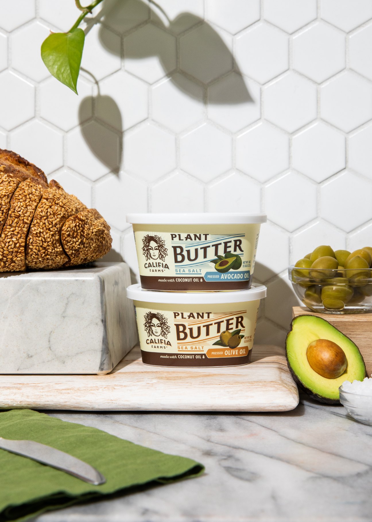
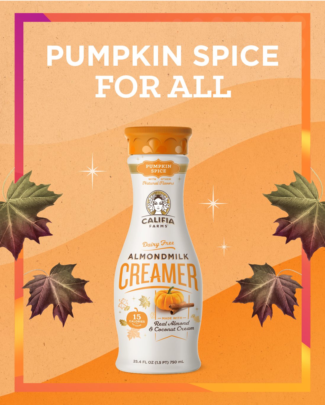
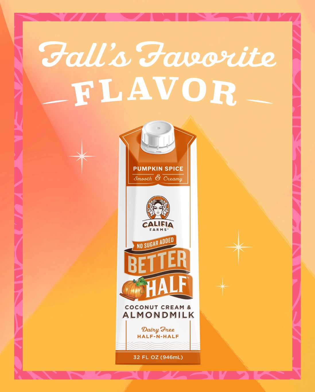
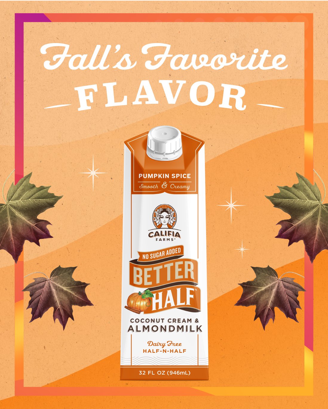
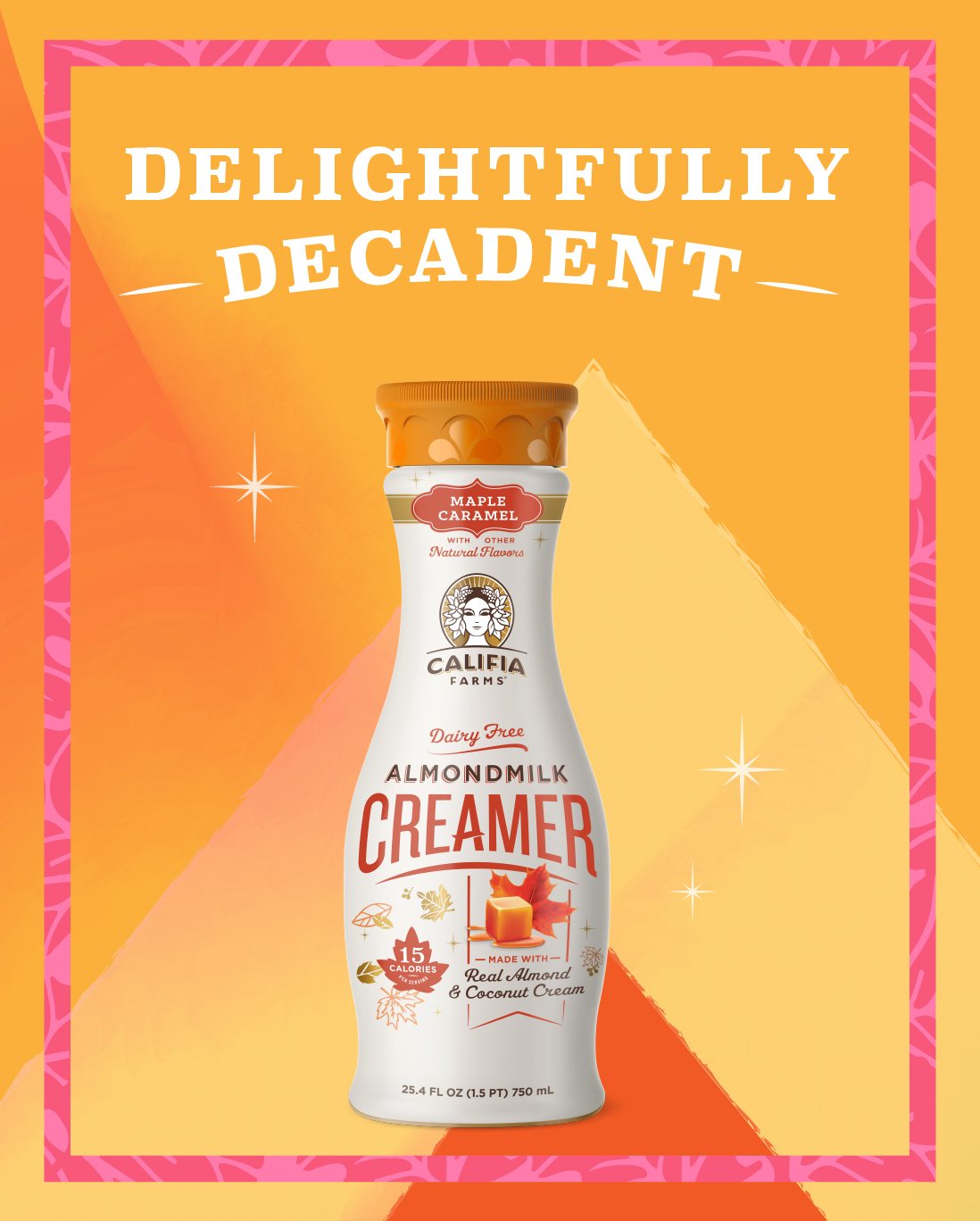
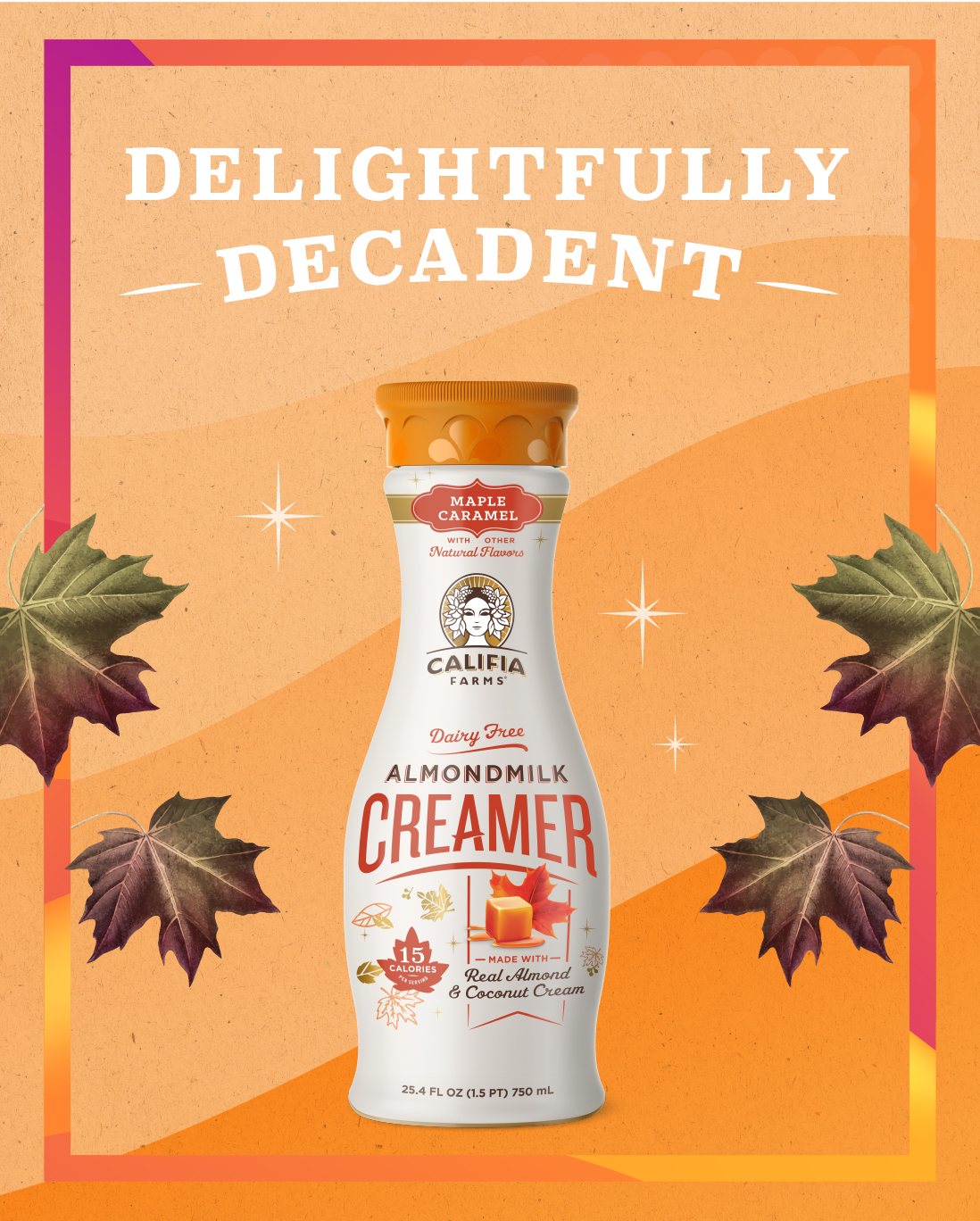
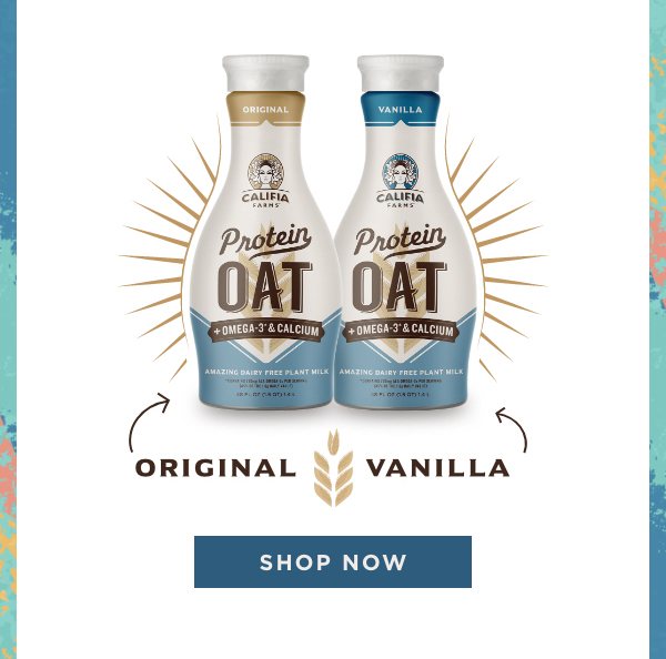
So I drew. Backgrounds and textures behind the fall pumpkin ads. New icons and graphics for the launch emails, every word set in Califia’s fonts, exactly by the book. And for Plant Butter’s launch, my hero piece: I took a perfectly nice studio photo and painted right over it, swapping the tiled wall for sunbursts, fruit-colored shapes and texture. That photo intervention is still my favorite thing from that year. It suited the brand, it suited me, and it started the graphic and painted photo interventions I’ve been making ever since.

Fall, in pumpkin and maple
Drag to explore →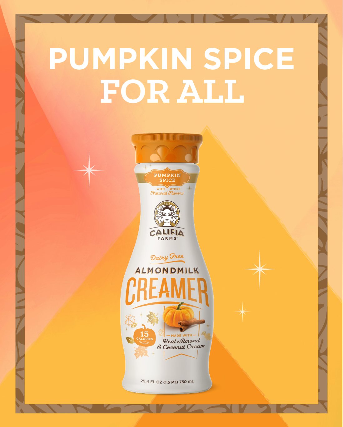
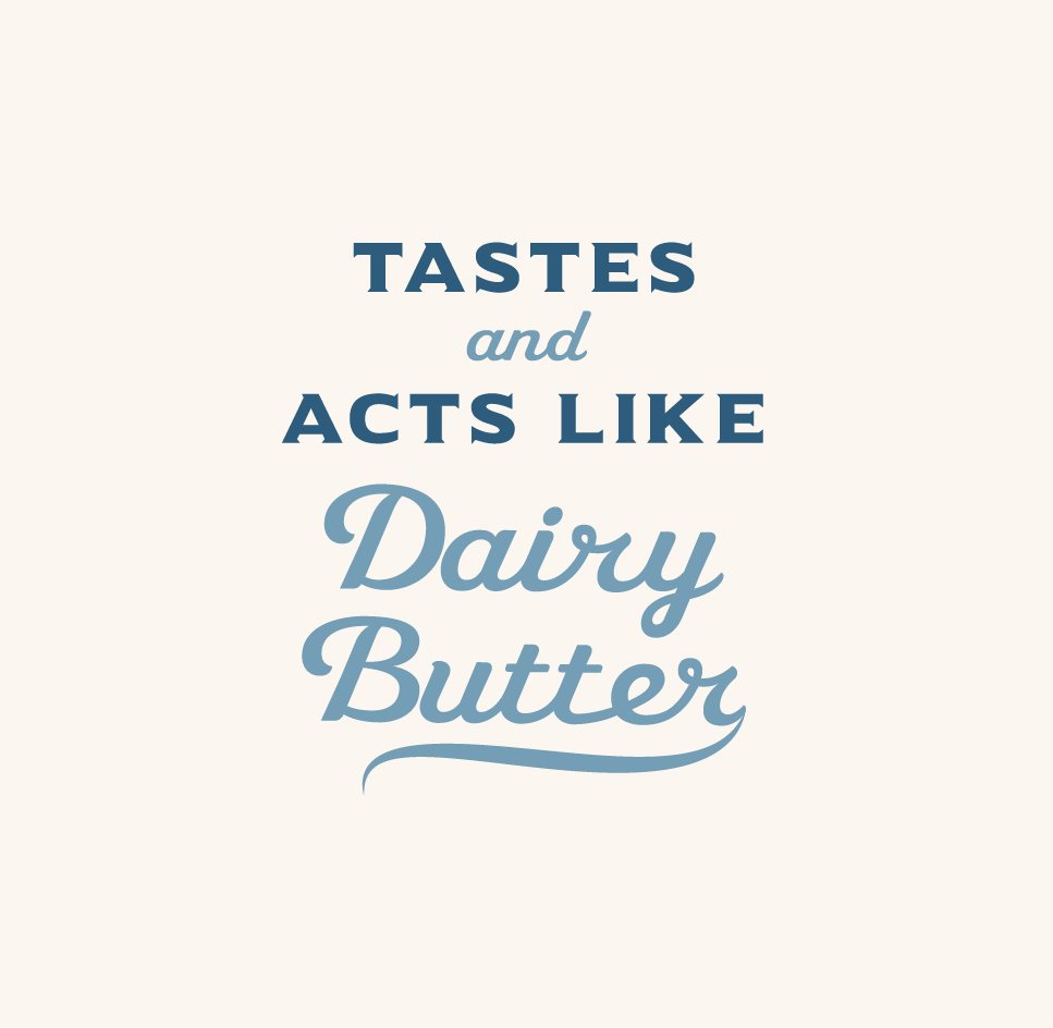
Type, set in Califia’s fonts



04 · Touch points
The stuff people actually touch
Small formats are where brands get lazy. They’re also where people actually touch them. My favorite of the lot is the Plant Butter media kit: a box that lands on an editor’s or influencer’s desk with about four seconds to make plant butter feel like an event. I designed it inside and out, from the lid to the foam topper that cradles the tubs.
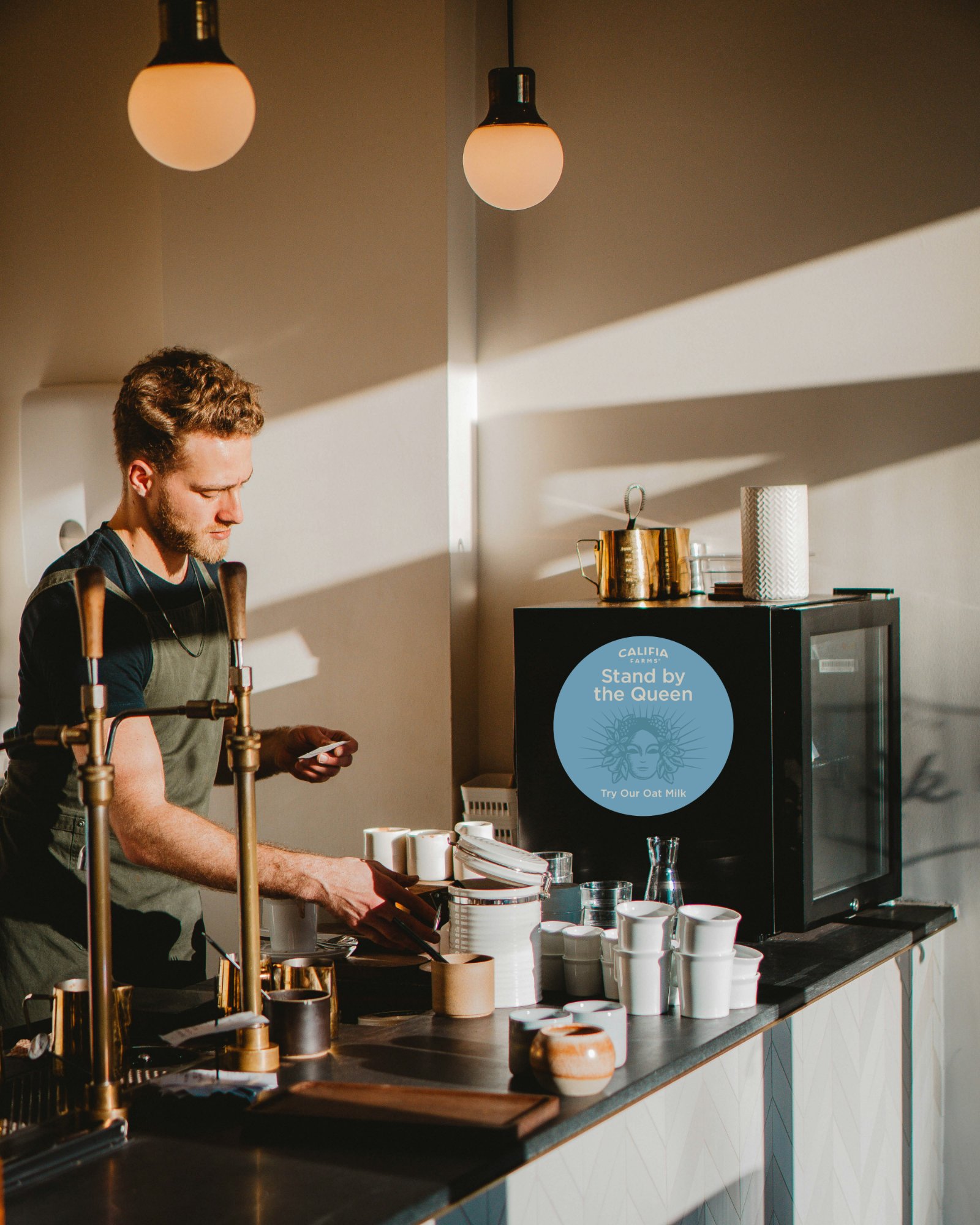
Then there’s Oat Barista Blend’s “Stand by the Queen” decal, made for cafés: the brand right where someone orders a latte, with Califia’s queen keeping an eye on the milk.
The Plant Butter media kit
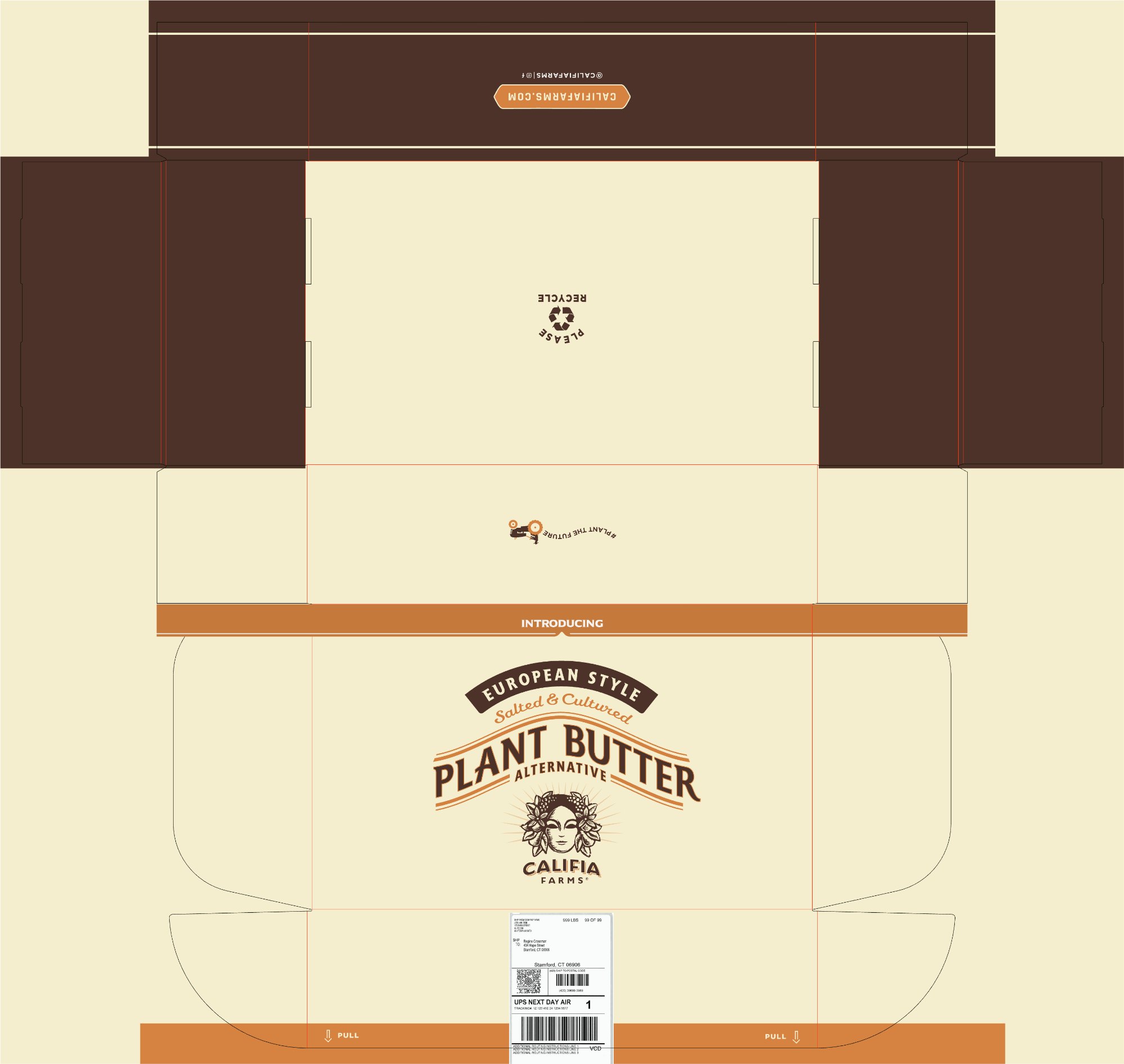
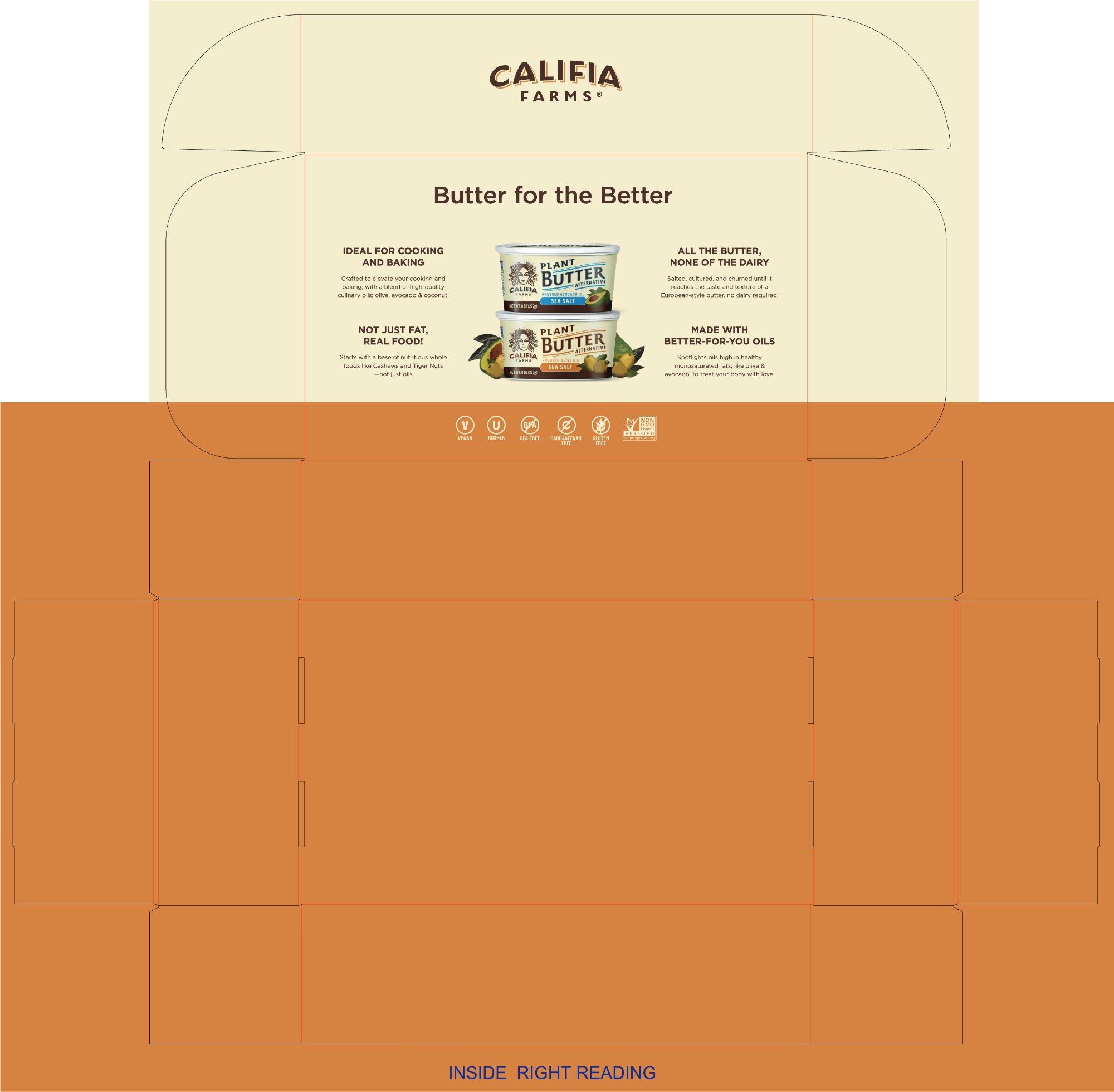
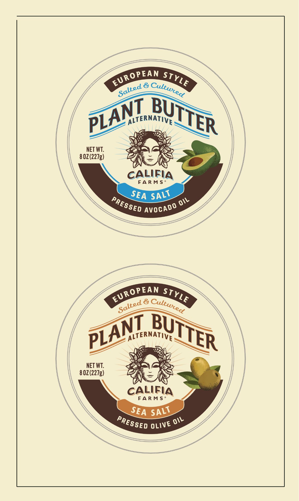
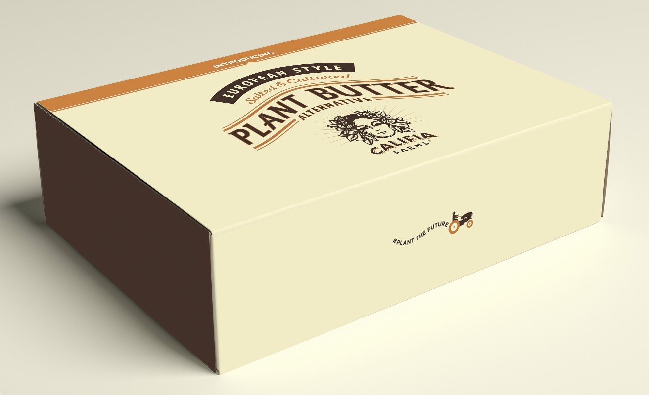
The layouts, illustrations, textures and dielines are my working files and finals, and the fridge and box mock-ups are my own Photoshop mock-ups (café photo by Bhuwan Bansal on Unsplash). The SYNERGY × Supergirl key visual was created by GT’s in-house creative team, and Supergirl artwork is © Warner Bros., shown here as part of the licensed campaign it appeared in. Califia’s woodcut illustration style and brand art belong to Califia Farms.
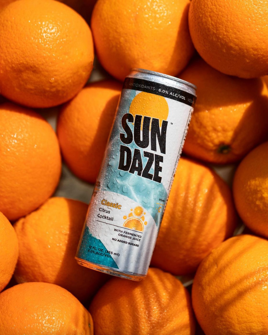
Next: Sundaze.
Another LA beverage, built from a blank page.
