Direction 01
Radical Italian Manual
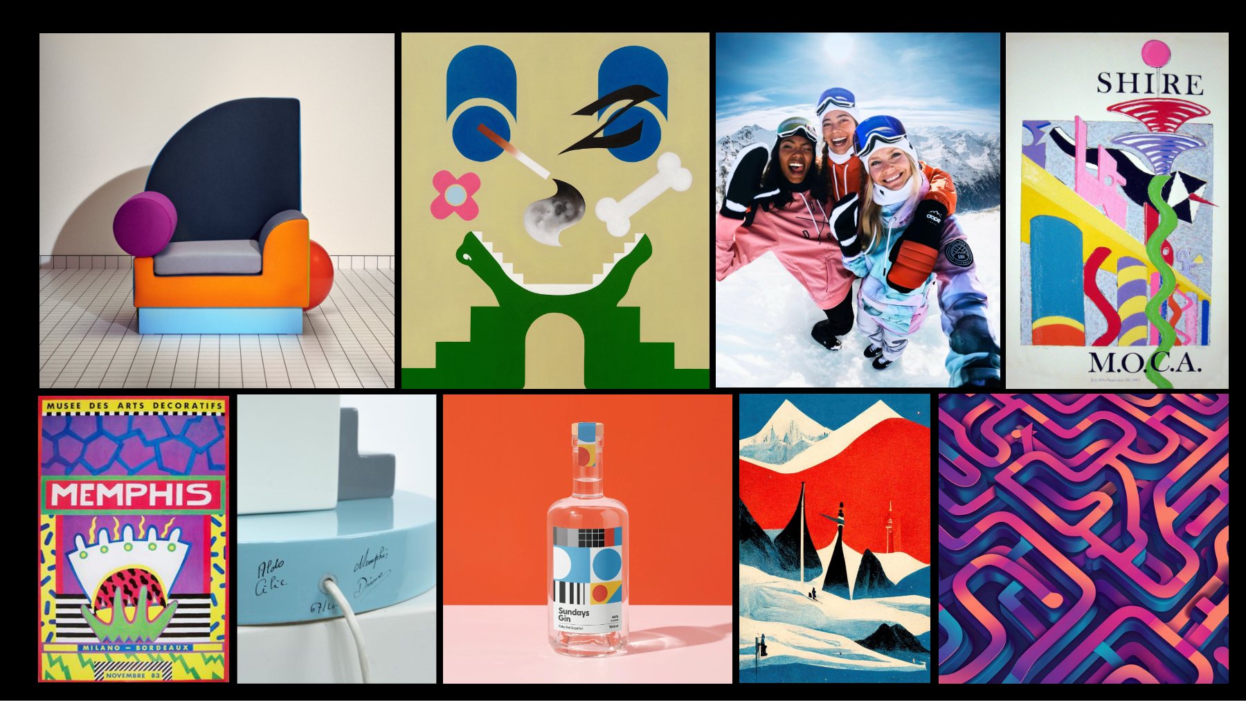
Memphis Milano goes après-ski.
Sottsass shapes and squiggles, frosted over, with Fenty graffiti on top.
Case StoryArt directionSan Francisco
Worlds, textures and type for Rihanna’s beauty brand, made at Kendo Brands (LVMH).
Art direction at its purest. At Kendo Brands, LVMH’s beauty accelerator in San Francisco, I built the worlds Fenty Beauty packaging grows from: mood boards, hand-drawn textures, custom lettering and concepts for gift sets, collabs and seasonal drops. Every one starts with art: a painting, a design movement, a downtown wall.
01 · Full circle
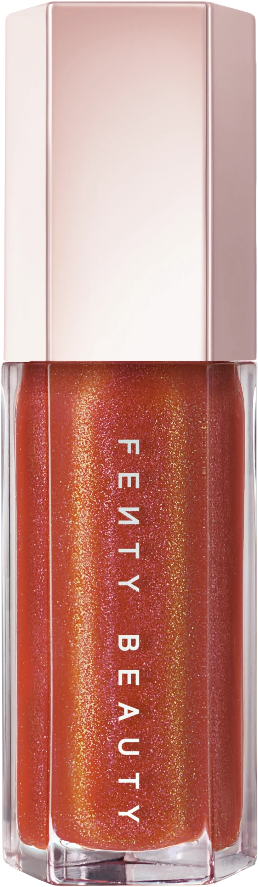
At Vita Coco, I worked on Hydrate Naturally, the ads starring Rihanna. A few years later, I was designing her gloss. Full circle.
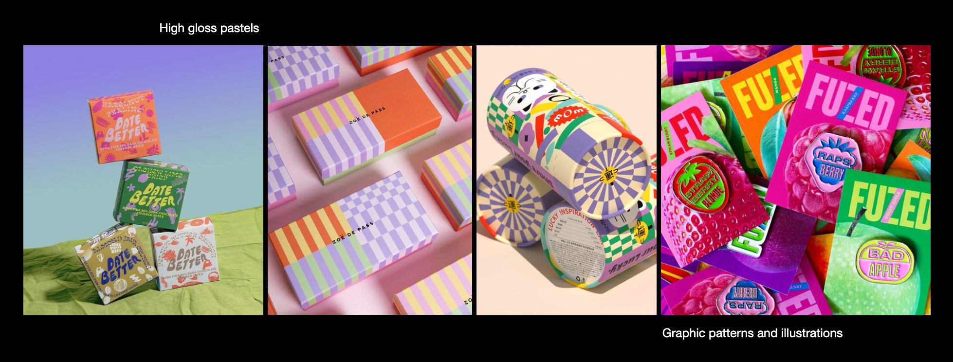
I’m an art history nerd who still paints in oils, so I never start with packaging. I start with art: a movement, a museum show, a moment that already moved people. Then I make it something you can hold.

02 · Fentyverse
Fentyverse is the whole Fenty family: Beauty, Skin, Hair and Fragrance. Beauty is loud. Hair is clean. Anything that spans them has to hold together without flattening anyone.
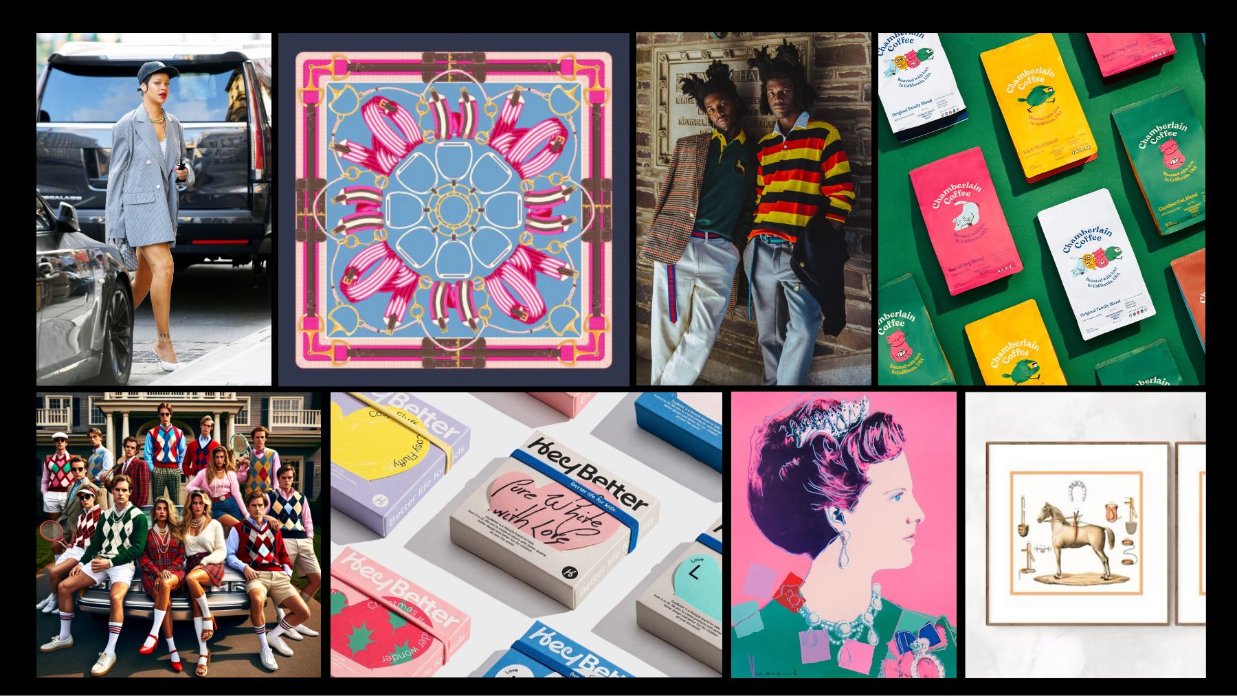
For one seasonal range, I pitched four directions. Each one is a mood board, then a second page on how it could land on the box.
Mood boards are collages of other people’s photos, used as reference. The bridges are mine.
Memphis Milano goes après-ski.
Sottsass shapes and squiggles, frosted over, with Fenty graffiti on top.
Old money, roughed up.
Clashing rugby stripes by way of Warhol’s pop royals, Basquiat in a striped sweater and a little Riot Grrrl.
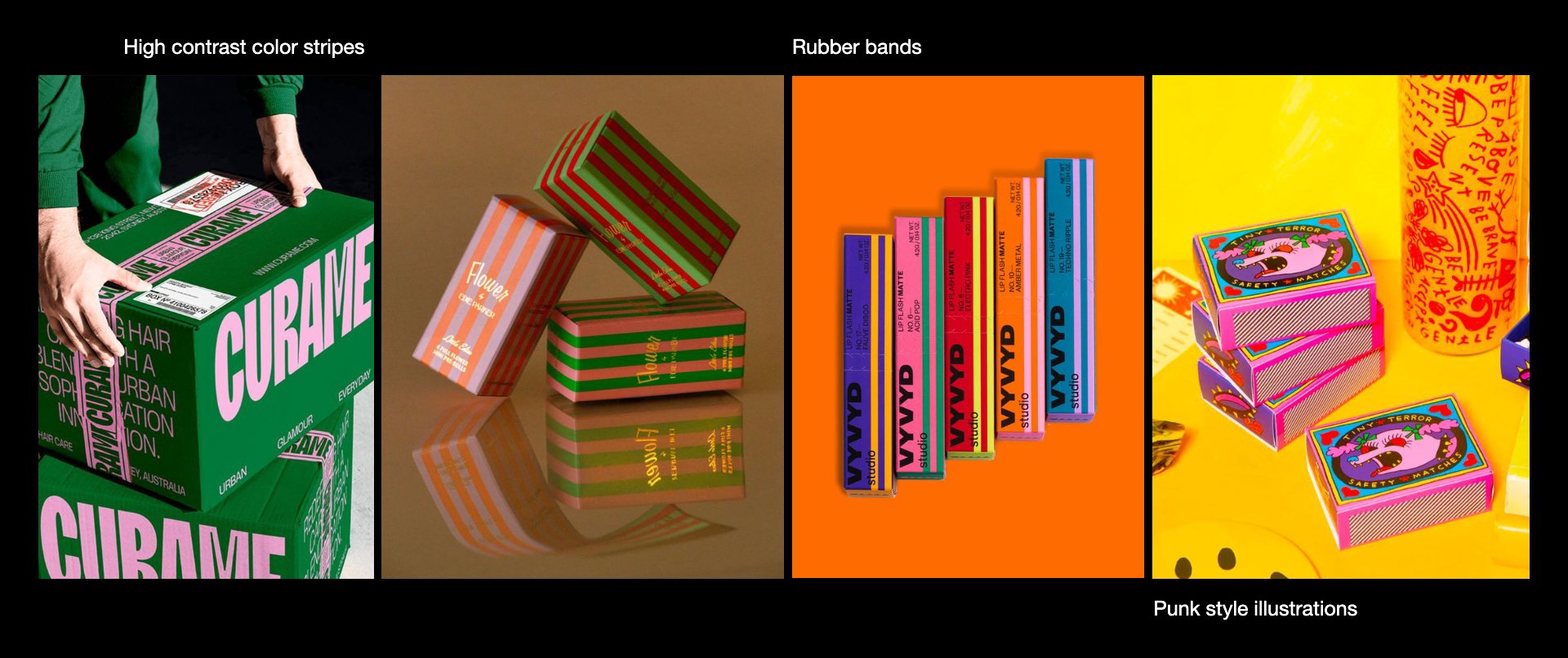
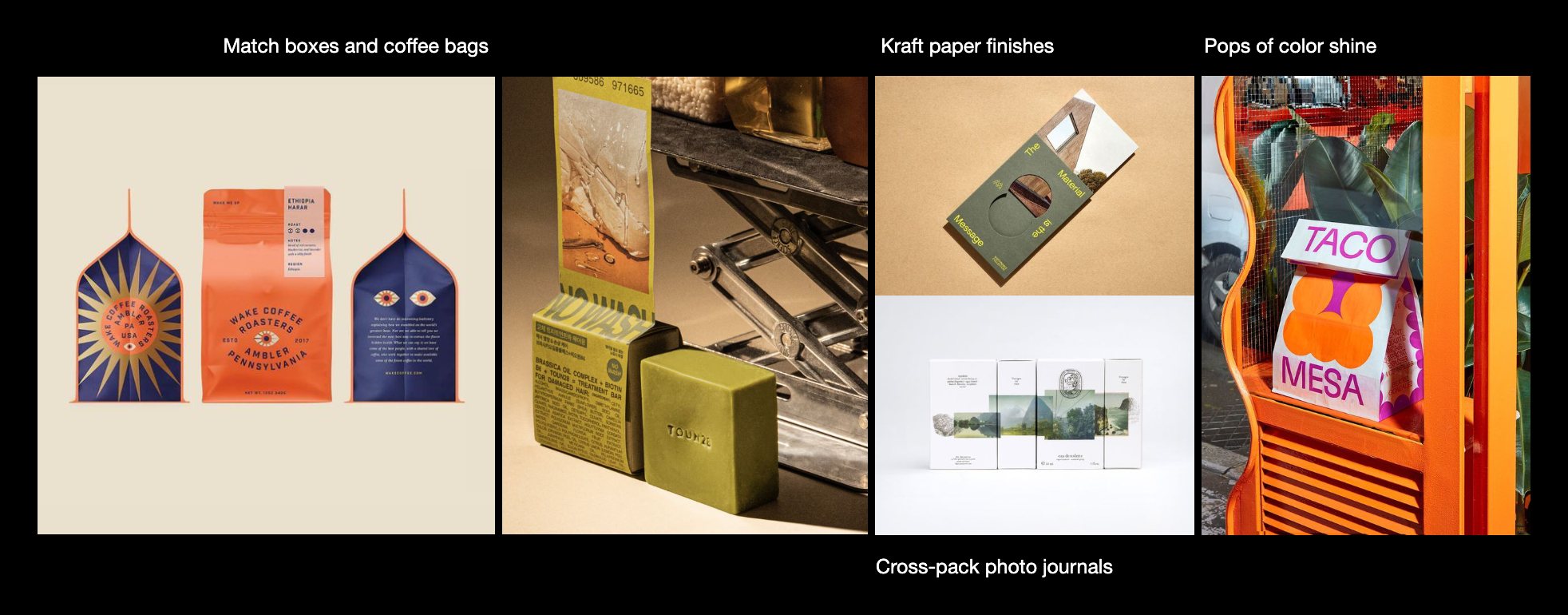
A book you could wear.
Bookmarks, margin notes, comic-book heroes and Rihanna lyrics scribbled Basquiat-style.


Island to icon.
Domino tiles, cocoa tones and the desert worlds of Dune.

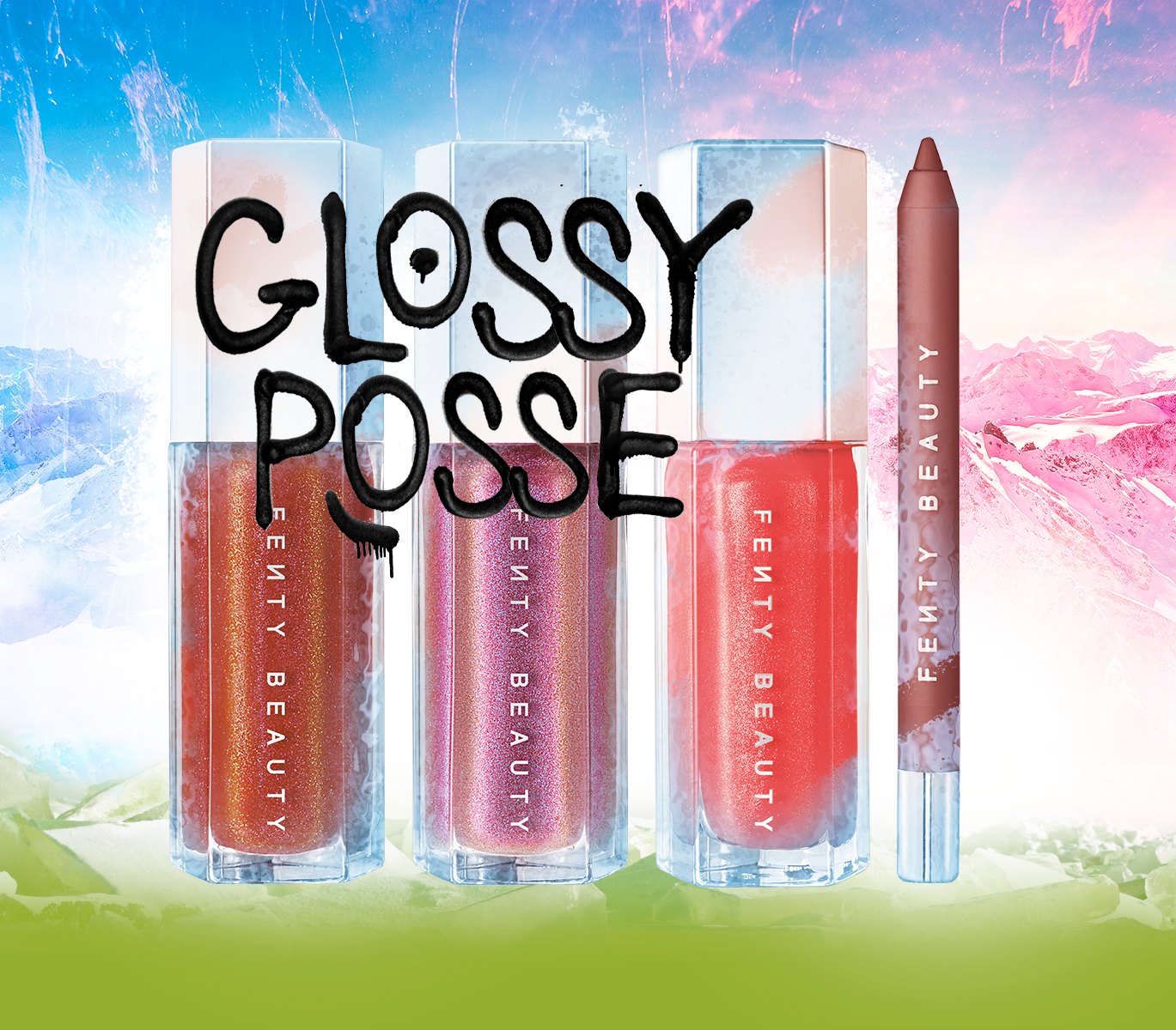
From Direction 01The ice
Radical Italian Manual’s frost and après-ski chrome carried onto Glossy Posse, the gloss gift set: graffiti over ice, a box that feels like a ski trip.
 Concept
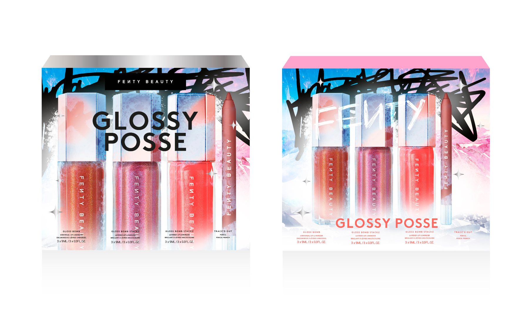 Concept
From Direction 04The camo route
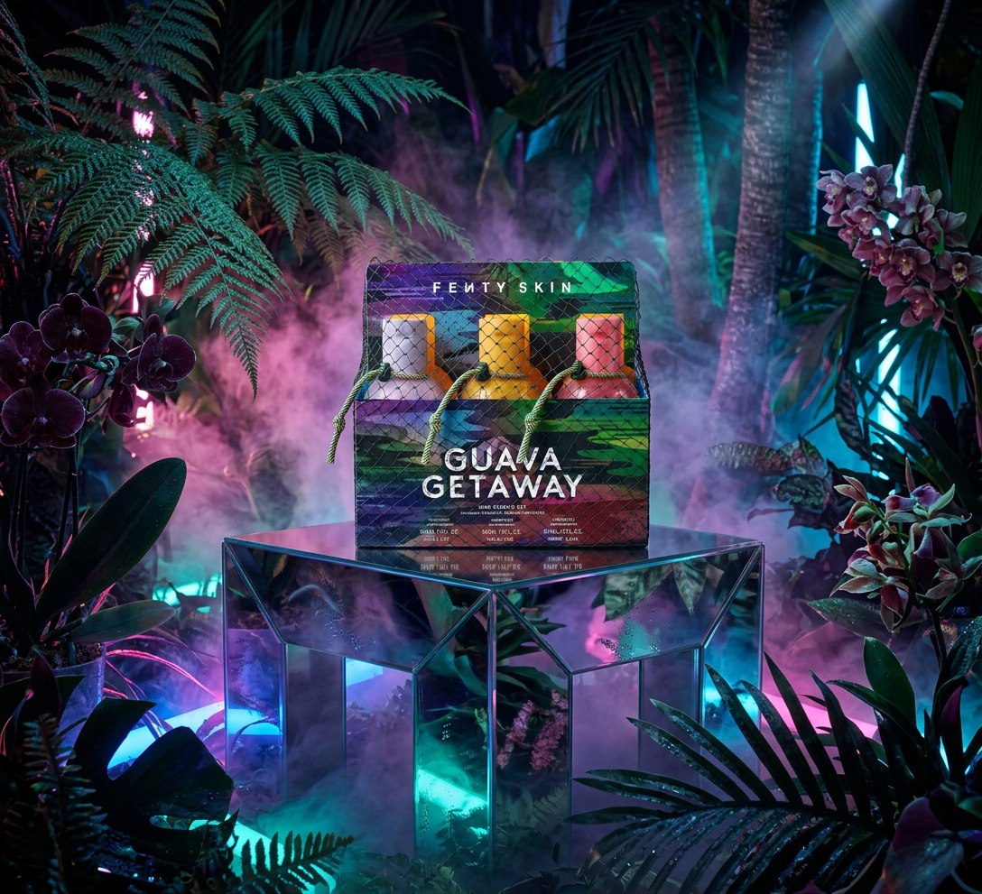
Caribbean Domino Diaries went off-duty, into camo: Rihanna’s uniform, with a nod to Warhol’s last paintings, across the range.
Then I shrank it onto a backpack the size of your palm, on a neon lanyard. It became the idea everyone remembered.
AI mock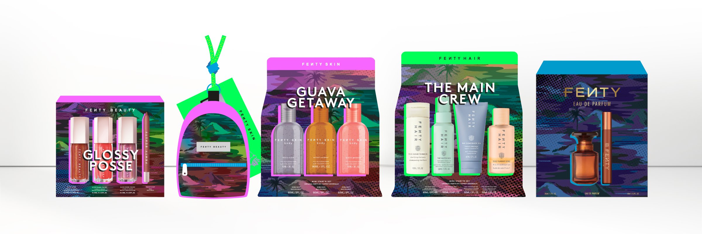 Concept
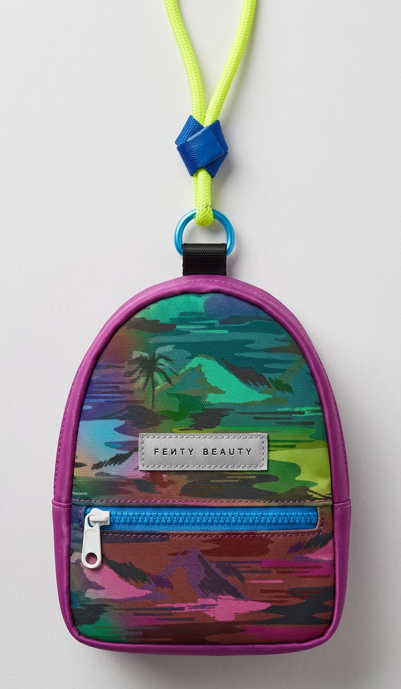 AI mock
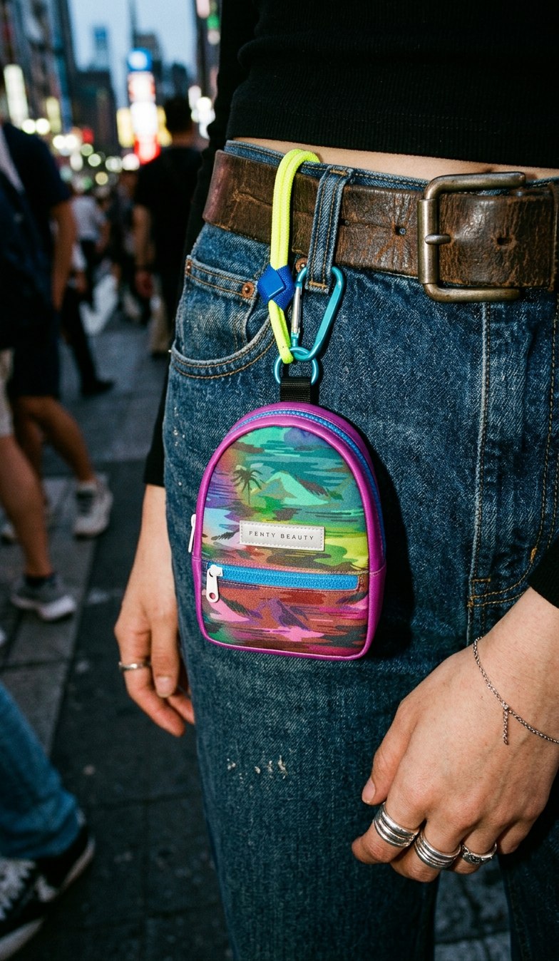 AI mock
03 · Texture
The Core Lip Sets started on my iPad. I drew every background by hand in Procreate: big, fast marks in the spirit of Cy Twombly that still feel delicate.
Same carton, a different mark, a whole new personality. That’s the difference between packaging that looks designed and packaging that looks made.
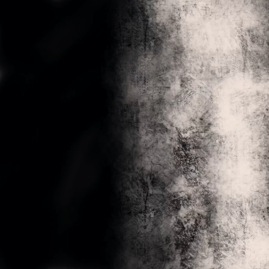
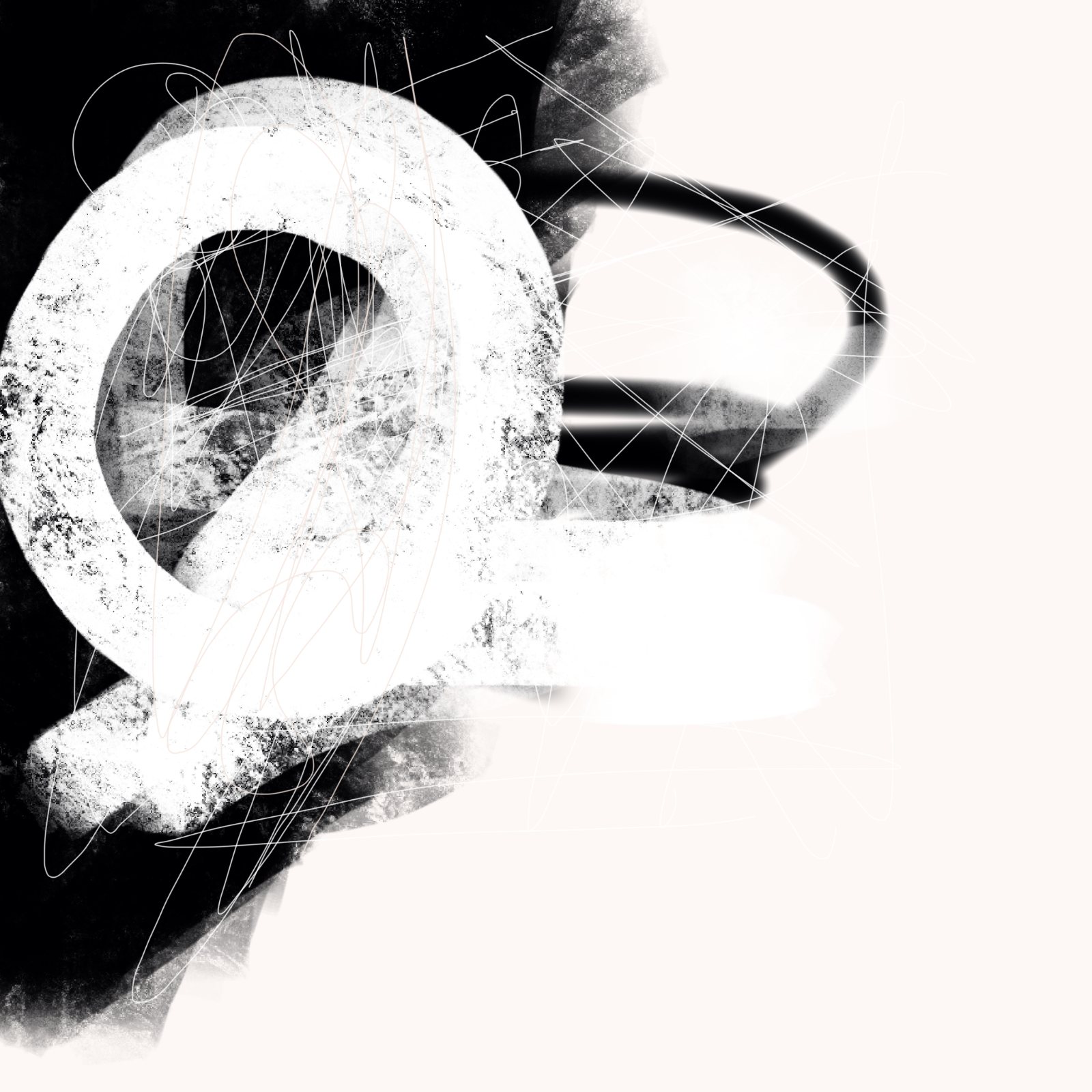
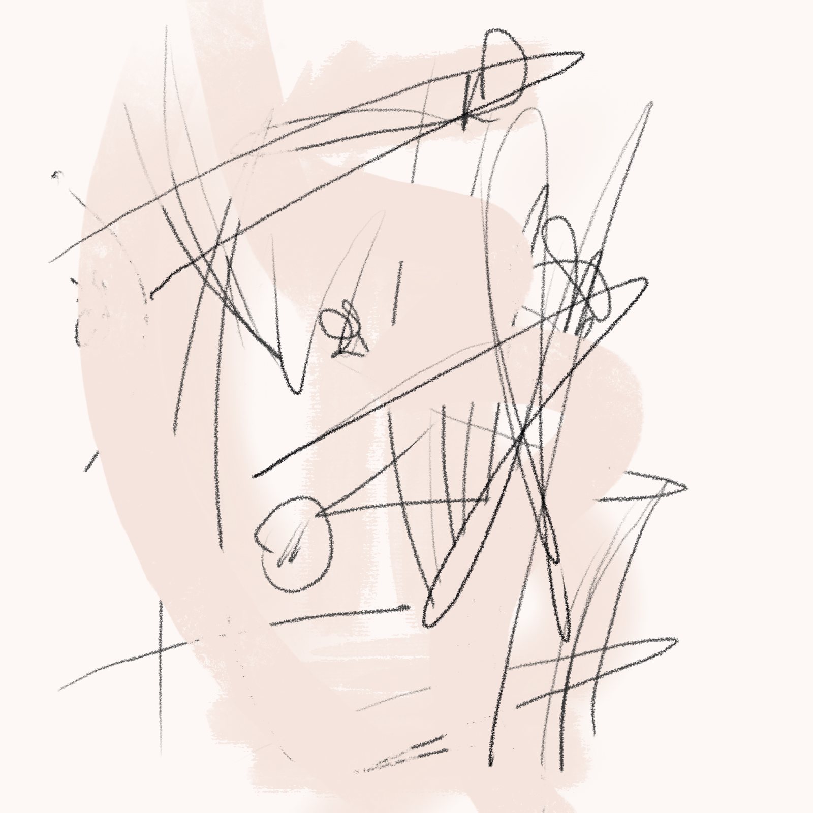
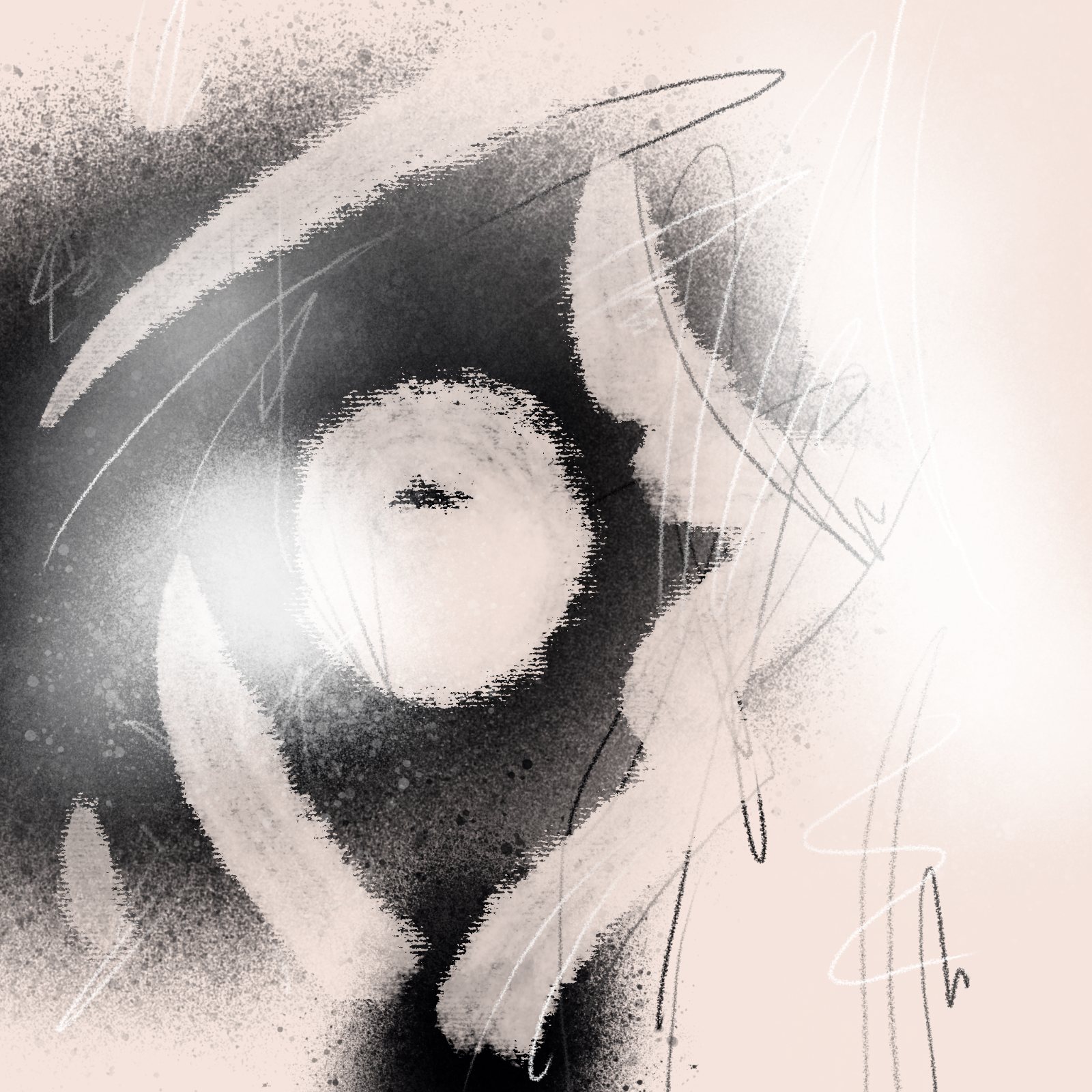
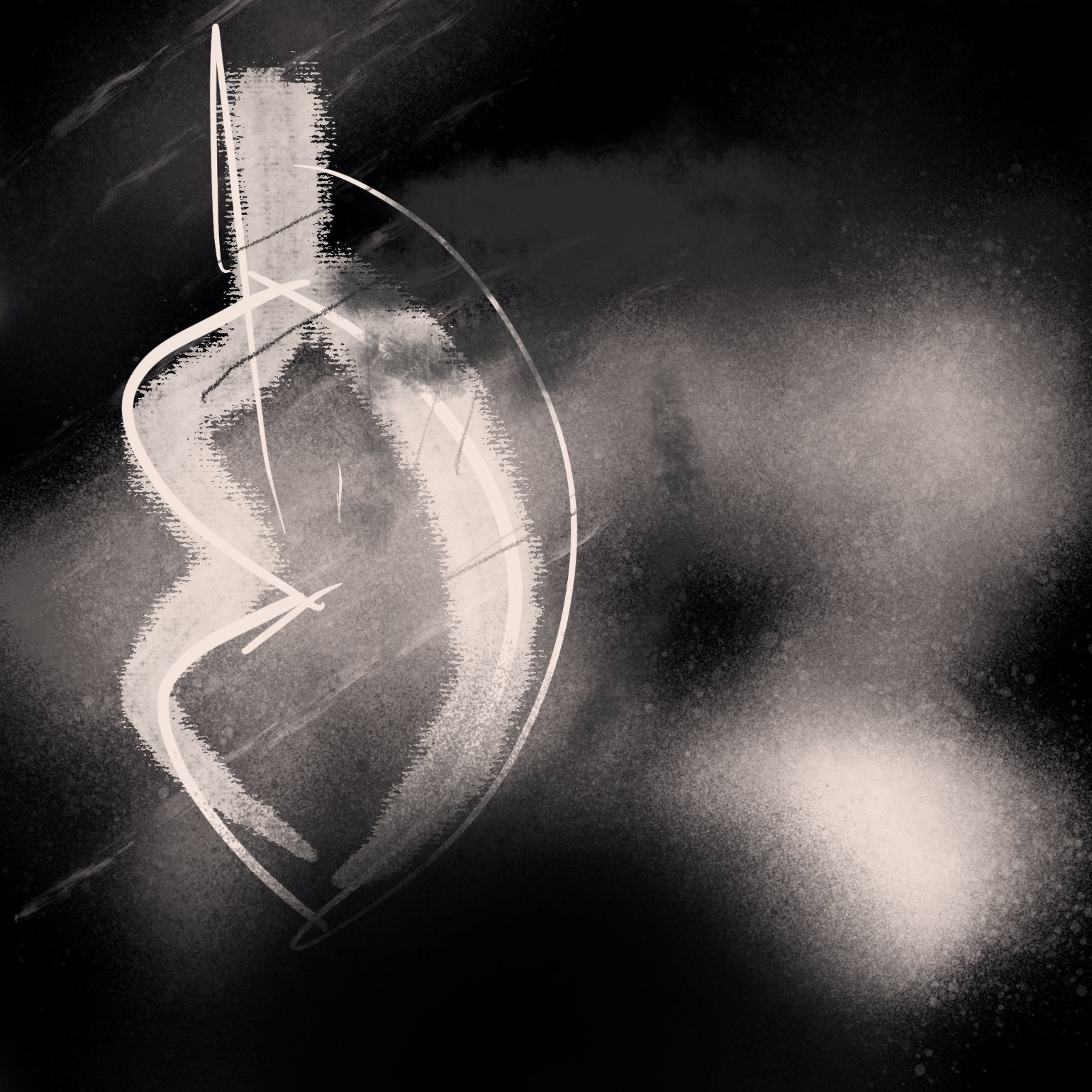
Tap a texture to restyle the carton ↓
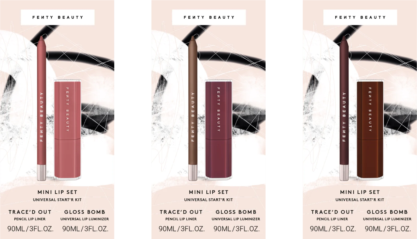
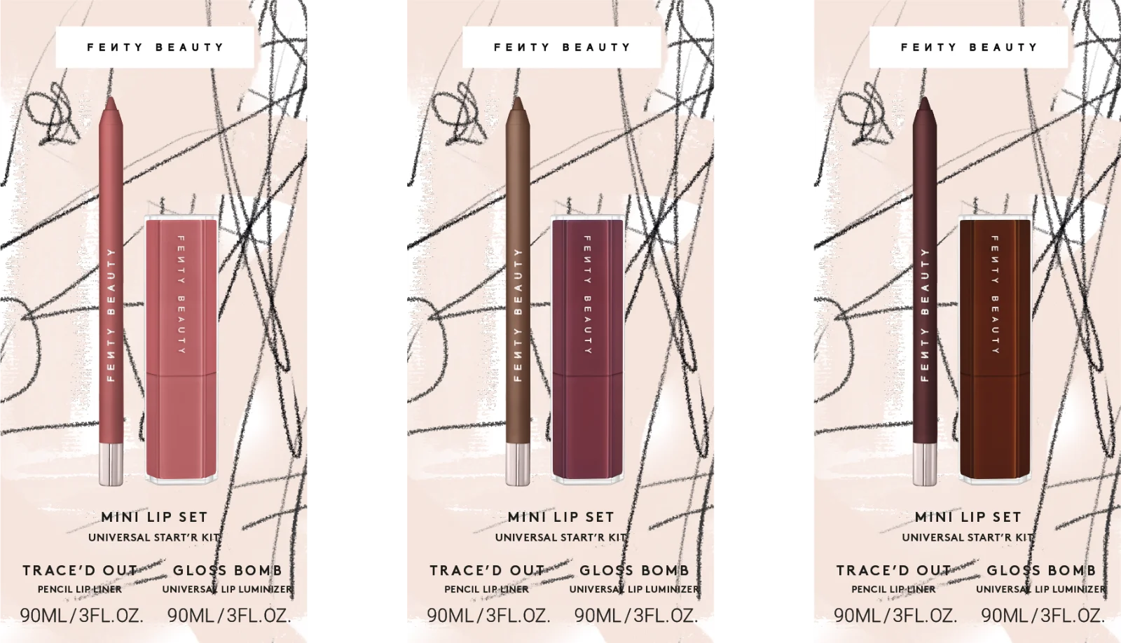
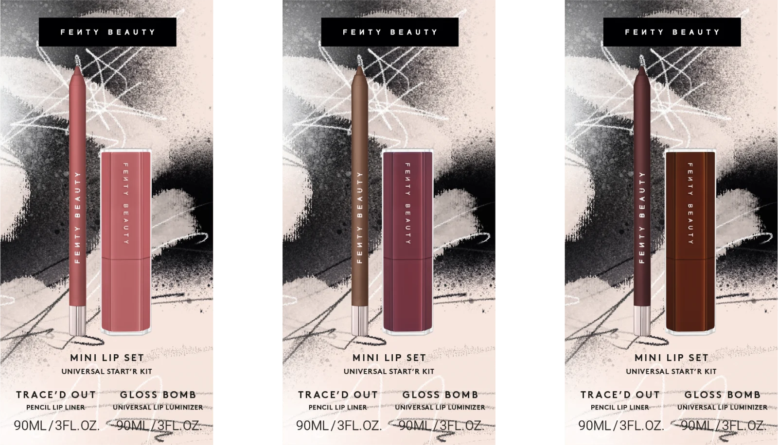
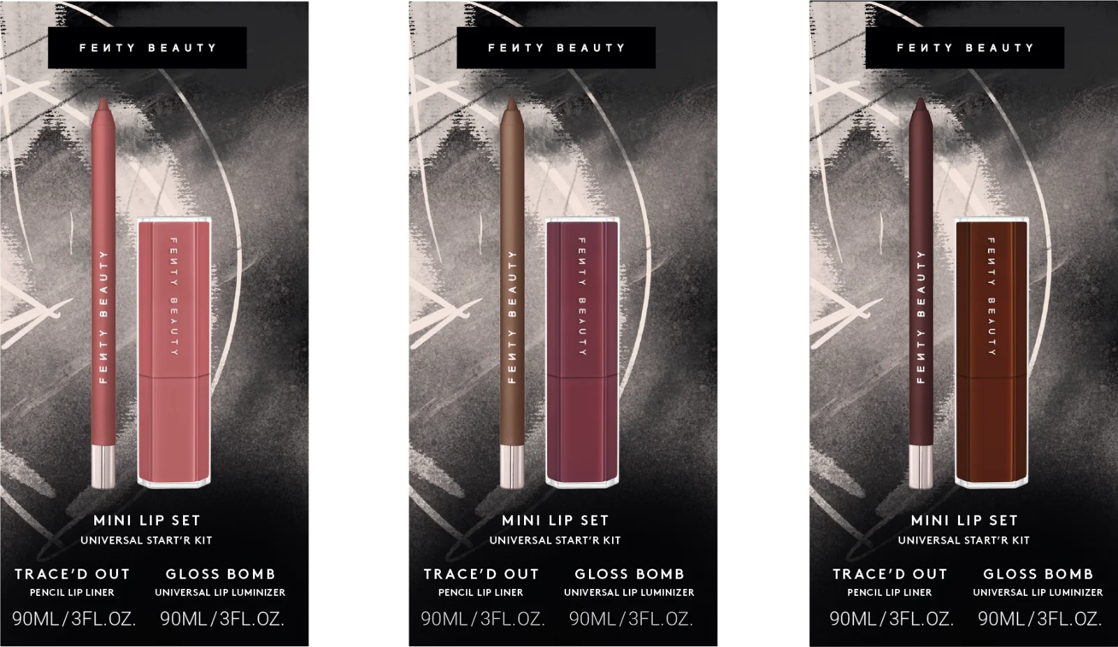
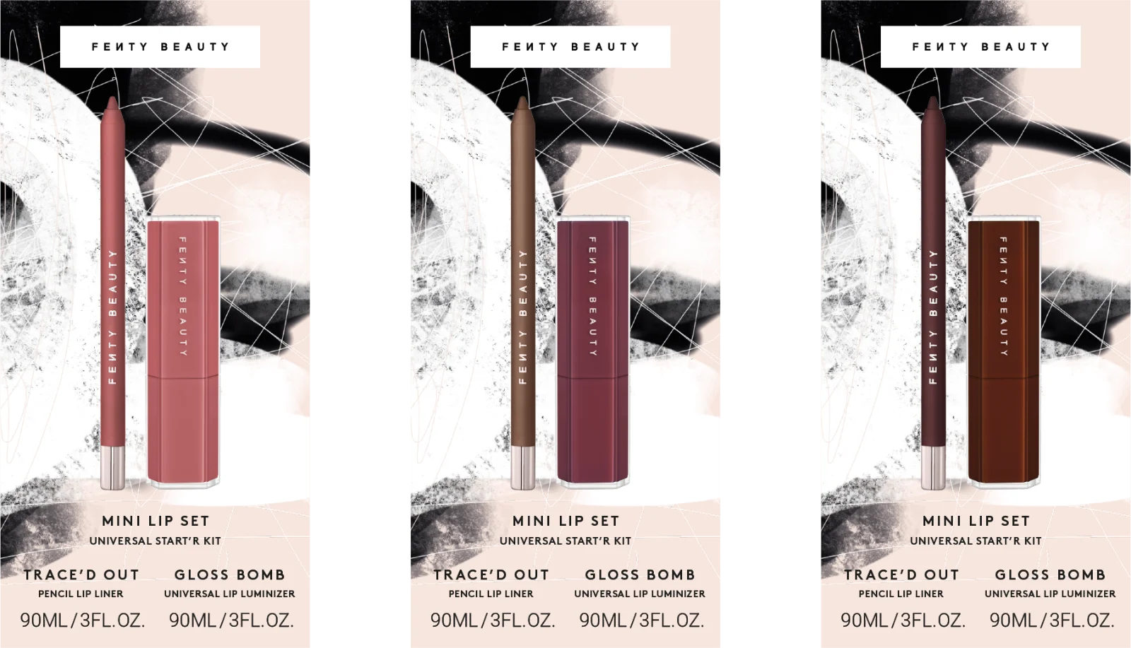
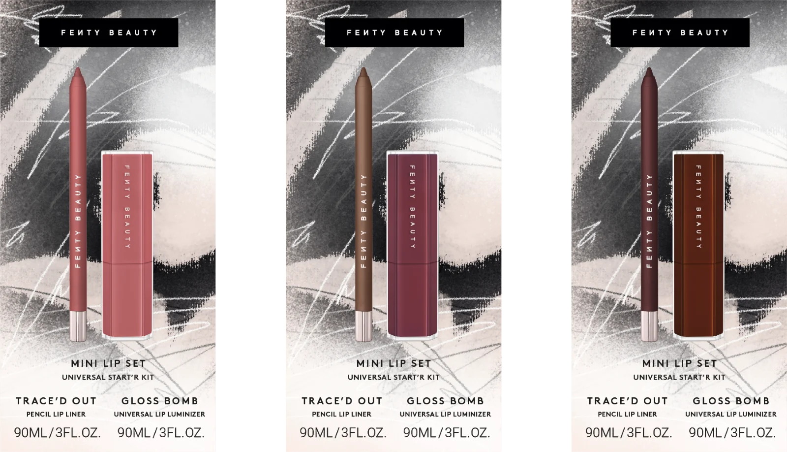
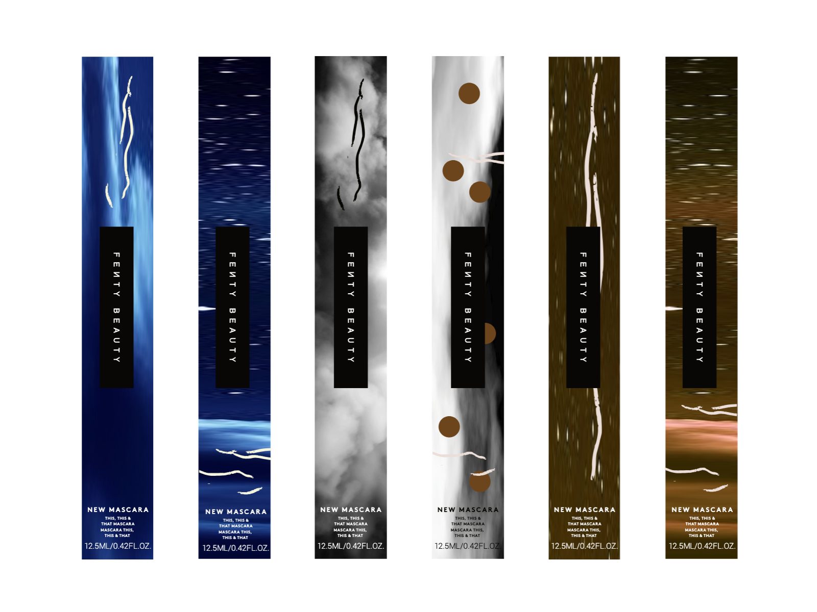
The same hand went small: a double-barrel pencil sharpener, and a run of mascara wraps painted with storm skies, smoke and ink.
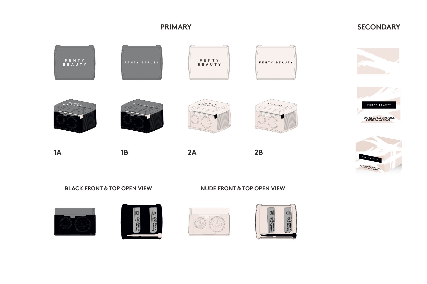 Concept
 Concept
04 · Type
Fire + Ice is a cooling Gloss Bomb. Three mood-board directions blended into its carton: Sticky Newsprint’s punk xerox, New York Street’s subway tile and chrome, and Iridescent Queen’s holographic light.
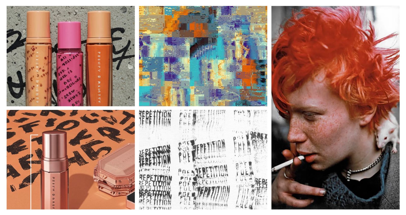
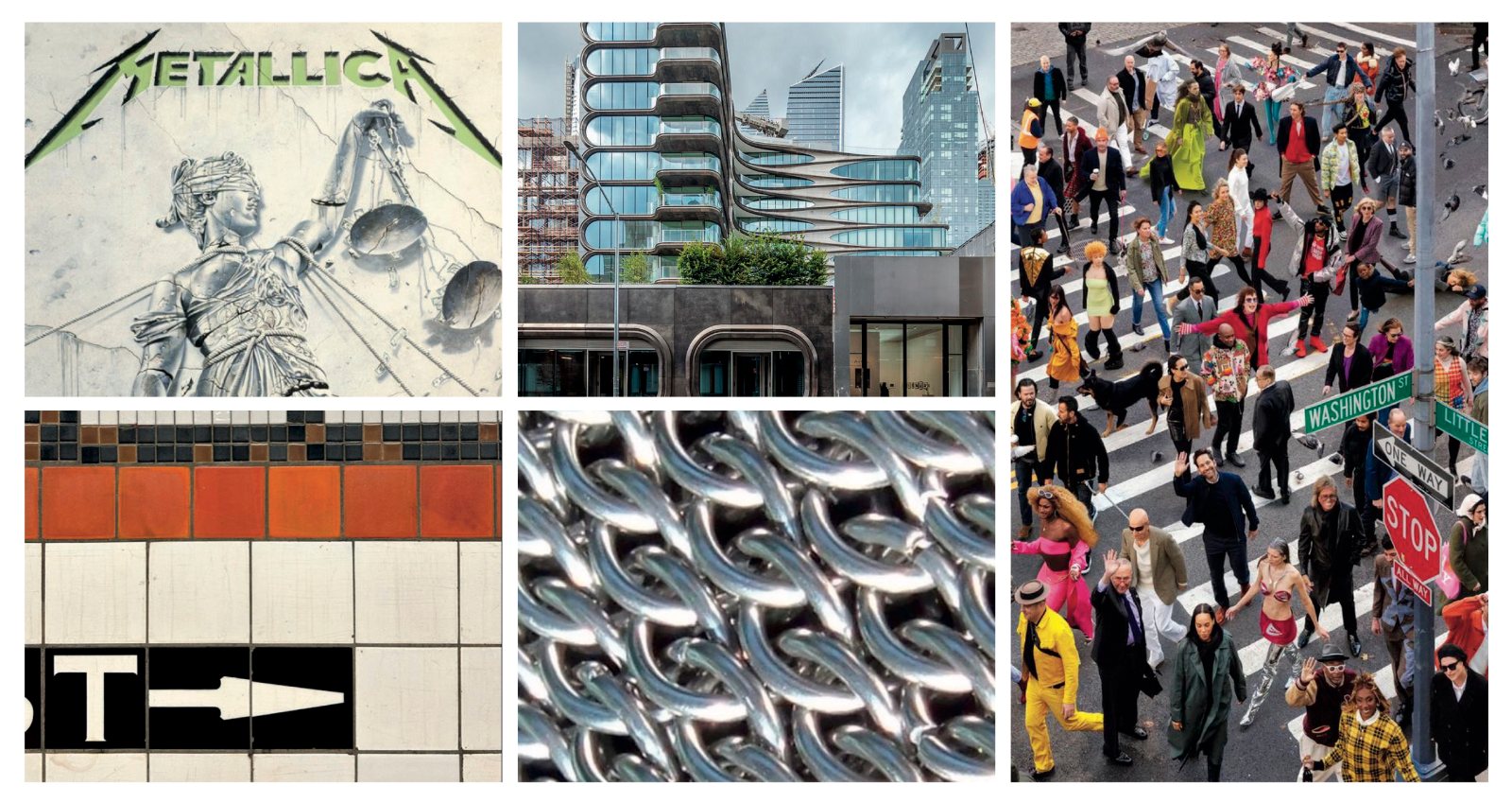
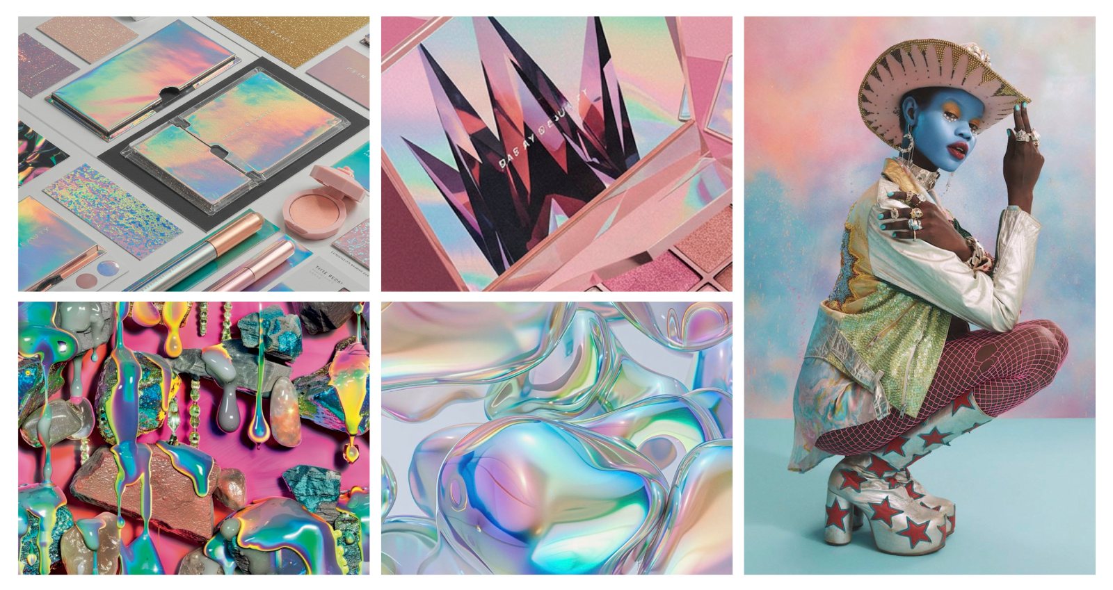
↓ Blended into one carton
The lettering melts and freezes at once: heavy-metal blackletter with a wink at Robert Frost, who wondered whether the world ends in fire or in ice.
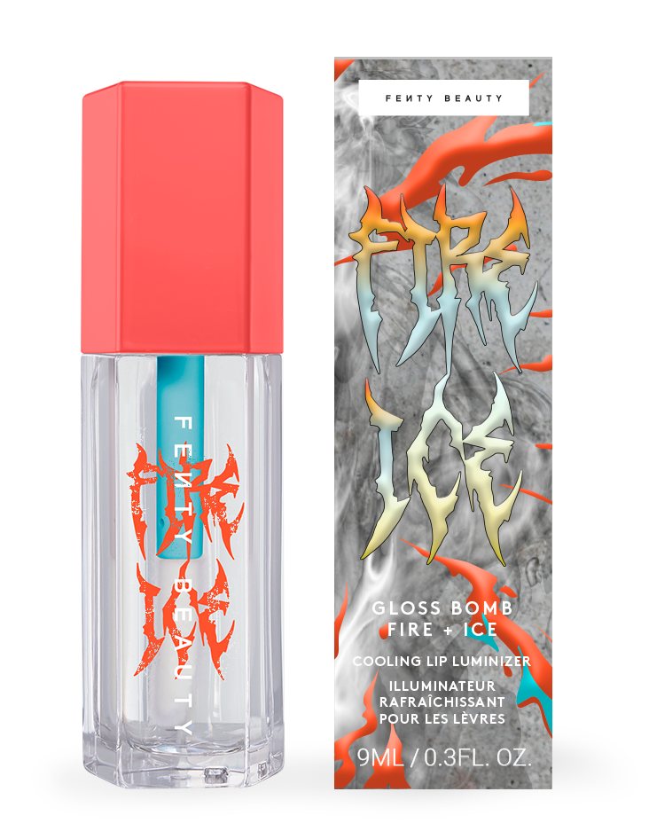 Concept
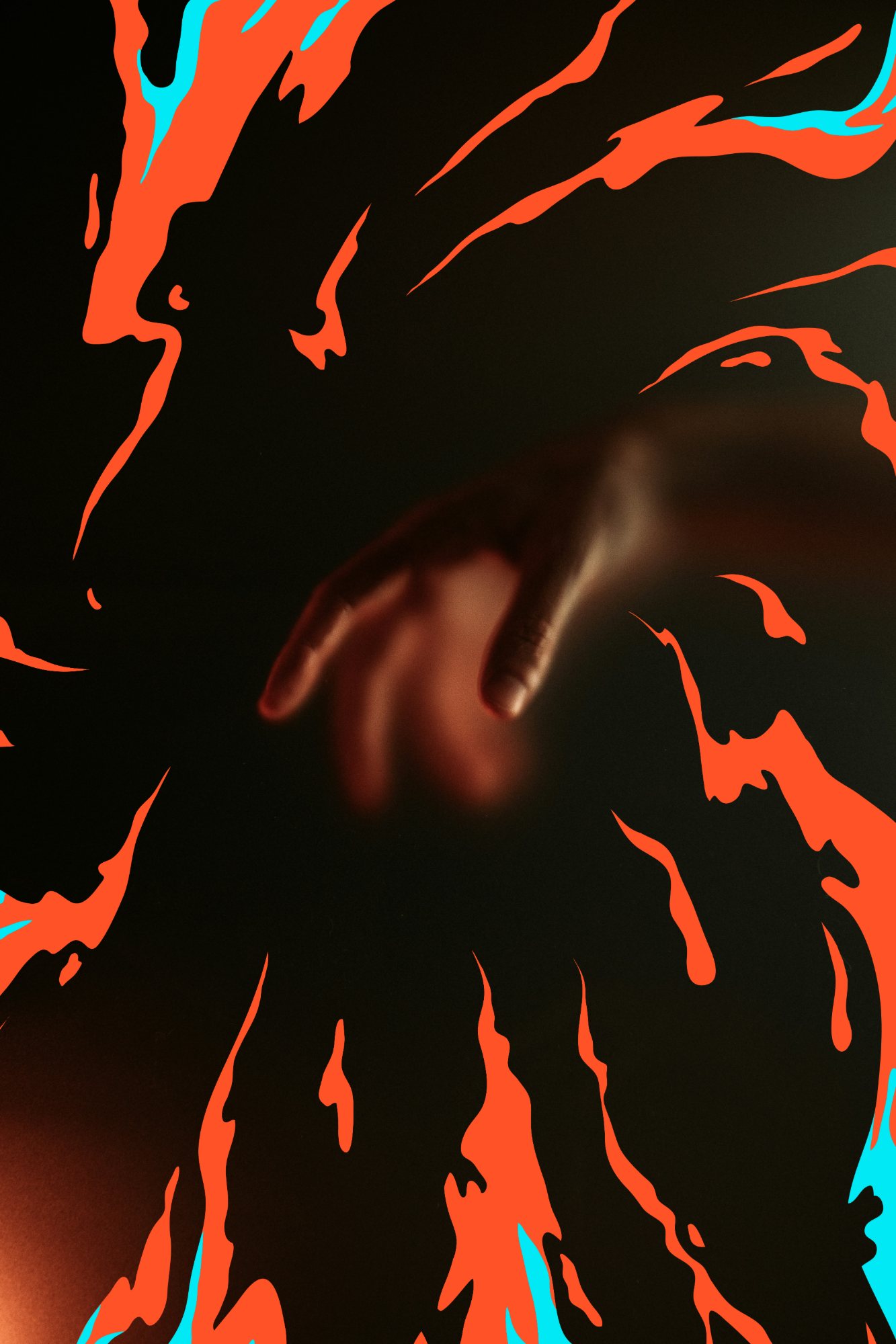 Mockup
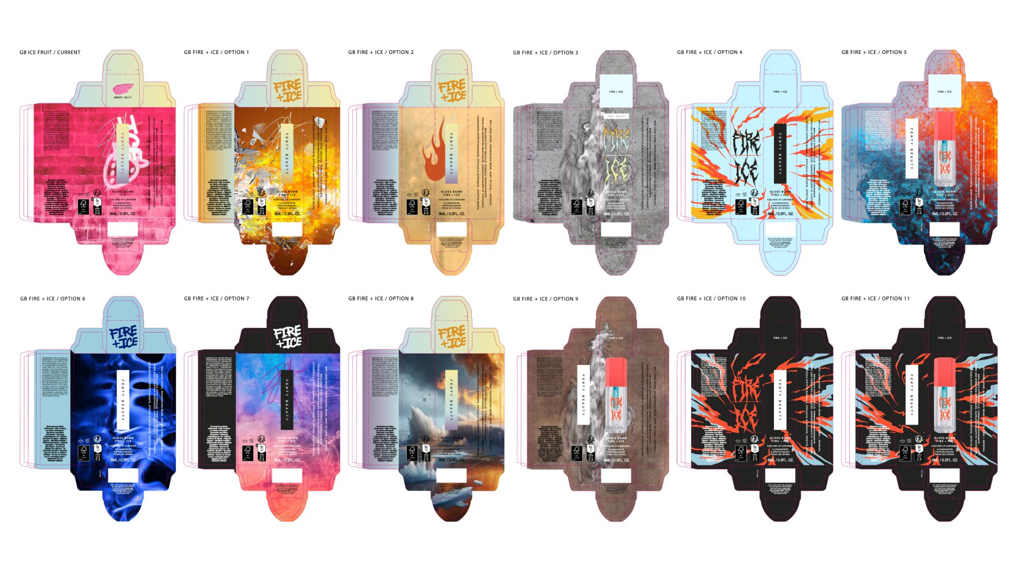 Concept
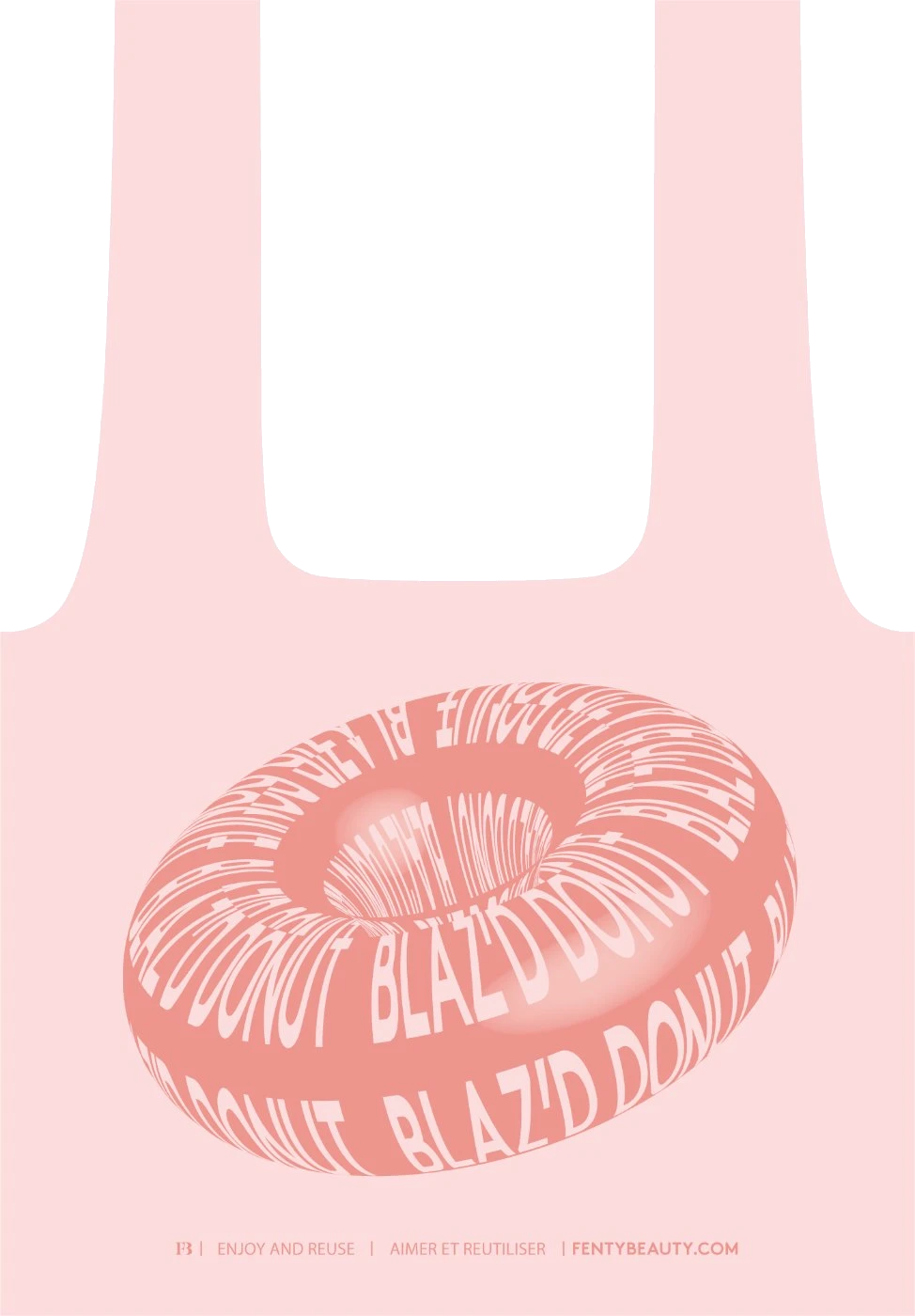
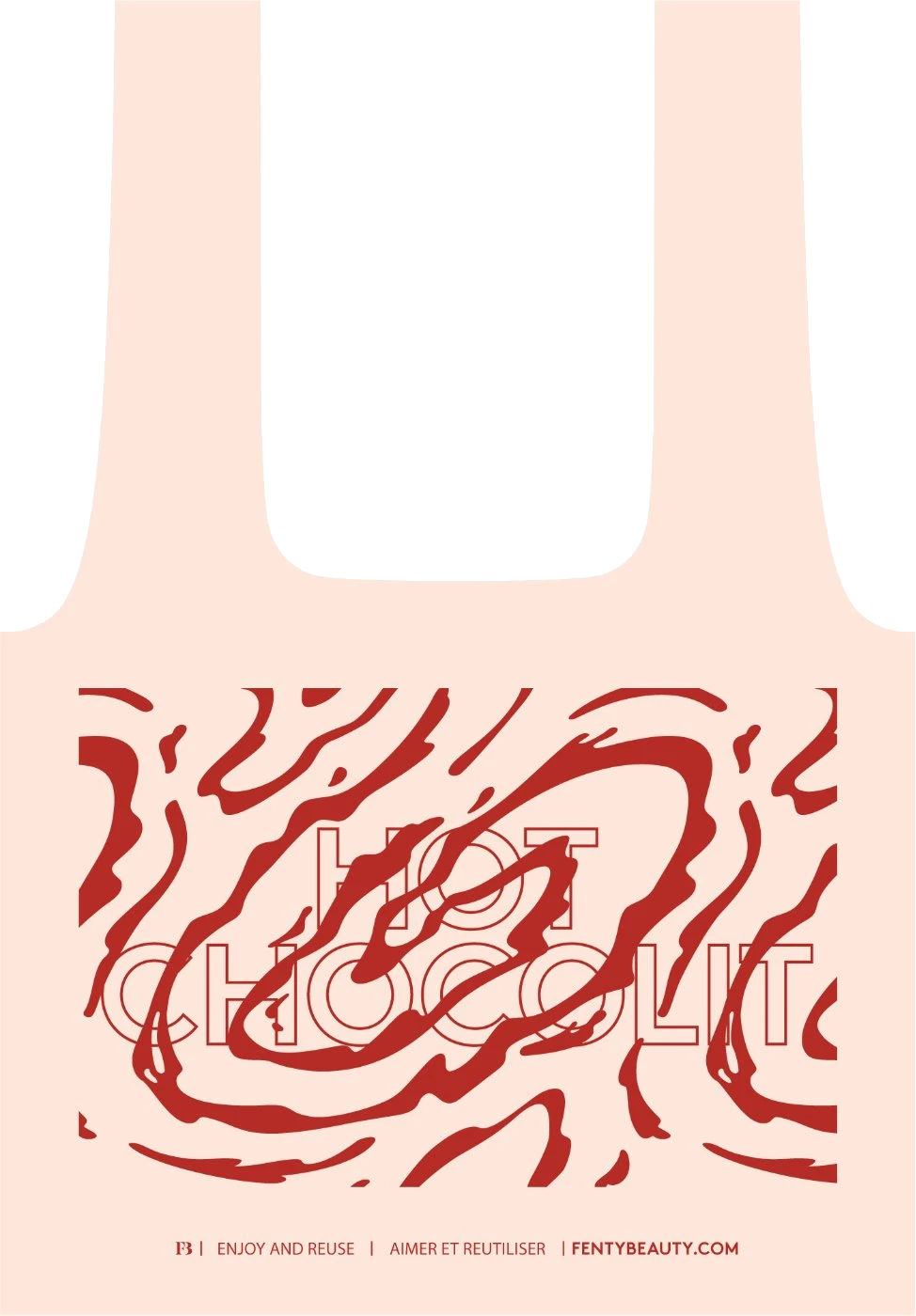
Ed Ruscha paints words like spilled liquid, and he’s one of my heroes. For the Gloss Bomb nylon totes, the shade names became the art: Hot Chocolit melts into swirls, Blaz’d Donut wraps around a donut.
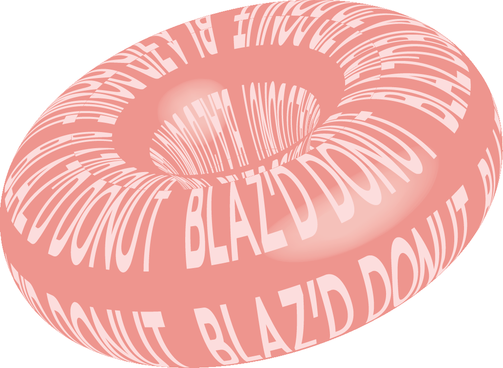 Final artwork
 Mockup
05 · Courtside
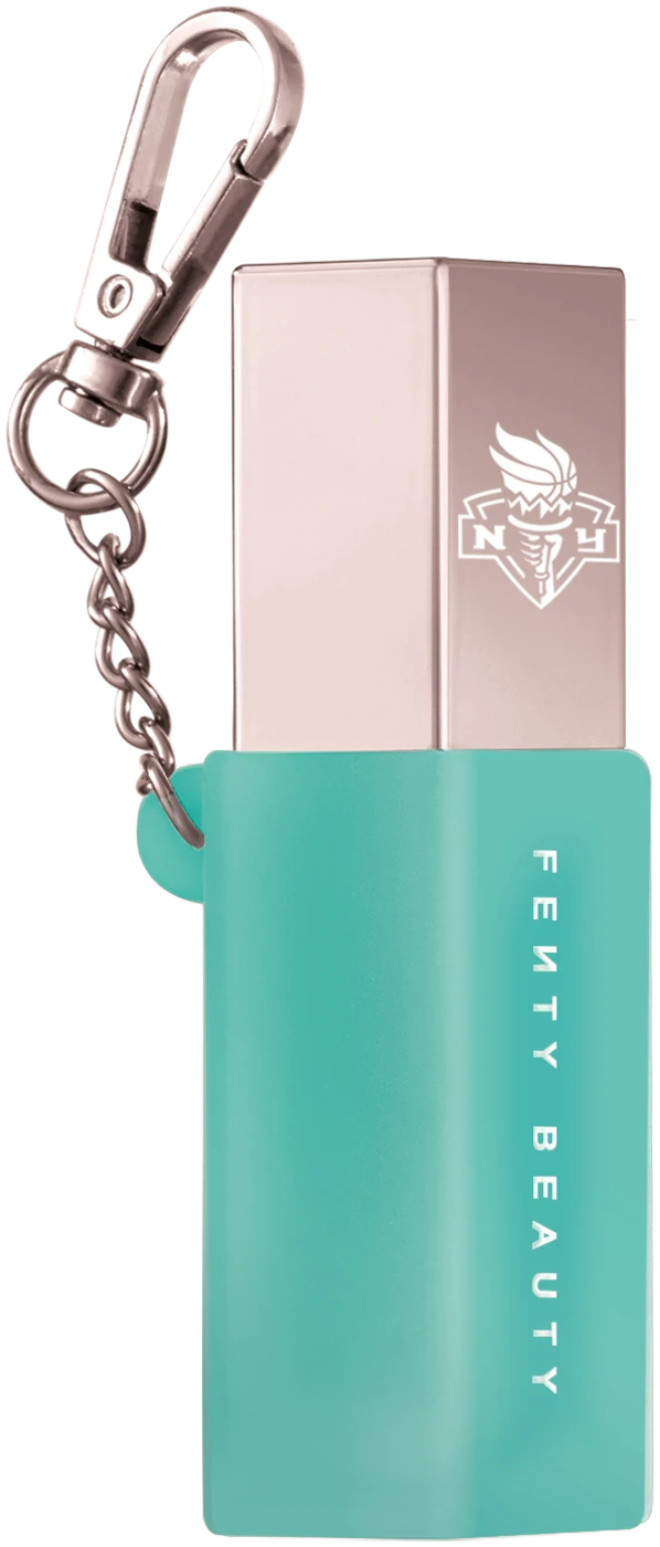
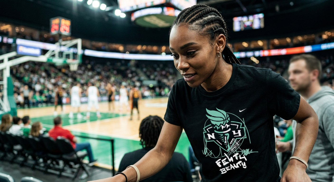
Fenty Beauty’s first sports partnership: the WNBA’s New York Liberty. The team’s seafoam green is the Statue of Liberty’s patina, so I started there, then went downtown, to the early-’80s New York of Basquiat and Keith Haring.
Limited Gloss Bomb cartons in basketball leather, graffiti and patina green. Then the swag, clean and vandalized, for the people who’d actually wear it courtside.
 Final artwork
 AI mock
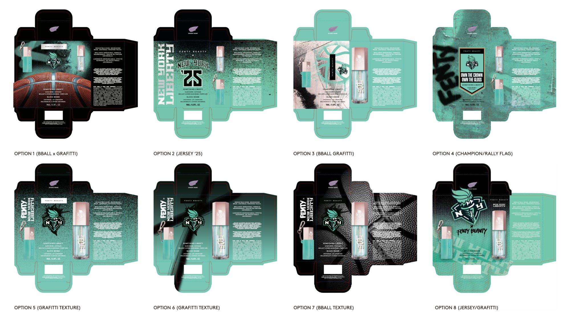 Concept
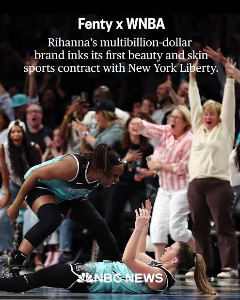
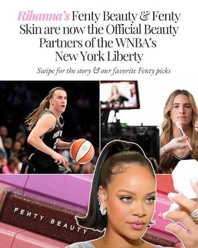
From pure craft to running the room: five brands, twelve designers and one system.
Up
